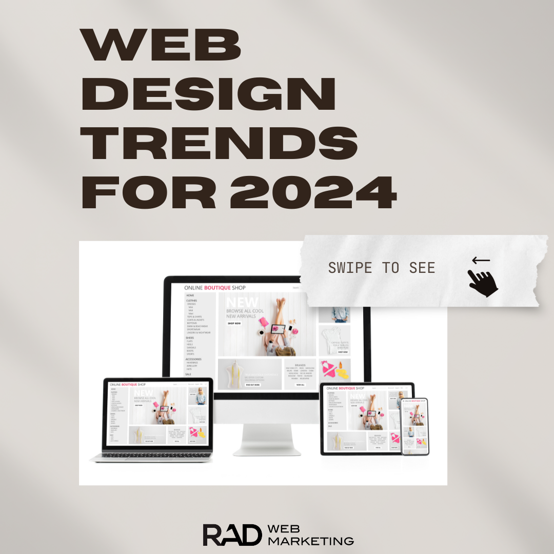
Looking ahead to what will be big for websites in 2024 – now is the time to start planning and getting your business up to speed with where the world of design and marketing is going. Did you know, it only takes 50 milliseconds, for your potential clients to evaluate and judge your business – based on the look of your website? This fleeting moment can determine whether they're captivated enough to stay or leave. If your website hasn't been modernized in a long time – now is the time to start looking into specific ways that you can elevate the experience for your customers – and start making better impressions. Here's are some of the top trends in website design for 2024 and beyond:
1. Minimalist Design:
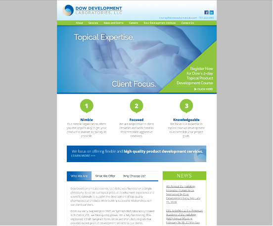
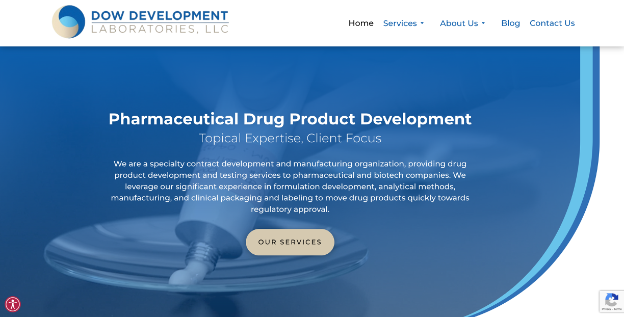
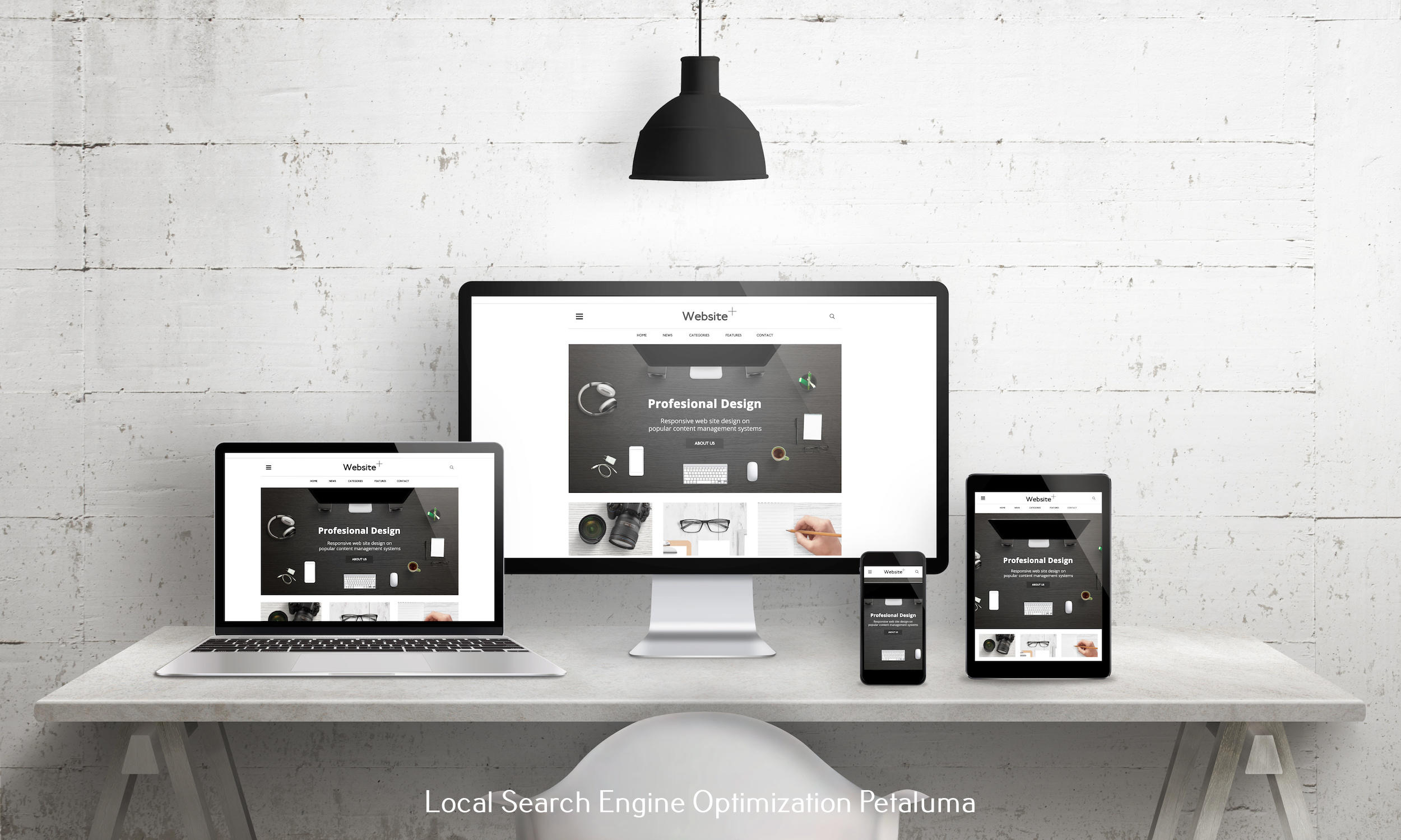
Minimalism in website design is all the rage these days, and it's easy to see why. Think of it as spring cleaning for websites – out with the clutter and in with the essentials. Instead of flashy colors everywhere, there's a more chill, limited color vibe that's easy on the eyes. Fonts are clear and simple, making everything a breeze to read. Plus, finding your way around a minimalist site is like a walk in the park. So, as the online world gets busier, these laid-back, easy-to-navigate sites are like a cozy coffee shop corner where everything just feels right.
Before
After
2. Customer-Oriented Copywriting
Ever heard the saying, “It's not about you; it's about them”? Well, when it comes to copywriting, that's the golden rule. Customer-centric copy is like having a heart-to-heart with your audience. Instead of shouting, “Look at us! We're awesome!”, it's more like, “Hey, we get you. We've been there, and we know how tough it can be.”
It's all about diving deep into what the user is feeling, their little hiccups, and those big challenges. Then, it's about showing them, “Hey, we've got the perfect solution for that!” It's like a friend who not only listens to your problems but also comes up with some pretty cool solutions. So, instead of a business bragging about how great they are, it's more about understanding, connecting, and making the user's life a tad bit easier.
Example of Business-Oriented Copy
“Welcome to our premier acupuncture clinic led by Dr. Jane Smith. With a Ph.D. from Beijing University and a Master's from Harvard, Dr. Smith is an expert with 30 years of experience and global accolades. Here, you're choosing world-class expertise.”
Example of Business-Oriented Copy
“Welcome to our premier acupuncture clinic led by Dr. Jane Smith. With a Ph.D. from Beijing University and a Master's from Harvard, Dr. Smith is an expert with 30 years of experience and global accolades. Here, you're choosing world-class expertise.”
3. Dark Mode Style Design
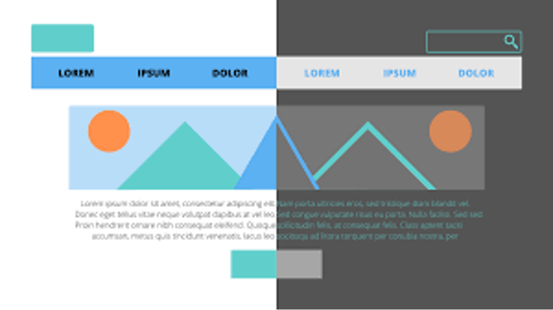
Alright, let's spill the beans on one of the hottest trends in the digital world: dark mode – and guess what? Web designers are hopping on the bandwagon big time! Imagine swapping the usual bright backdrop for a chic, dark canvas with light-colored text popping out. Not only does it give your eyes a break (no more squinting at glaring screens), but it's also a lifesaver when you're diving deep into lengthy reads.
But wait, there's more! Using dark mode can be like giving your mobile device a little energy drink, helping to stretch out that battery life. Now, while it might not be every website's cup of tea, if you're loaded with text or aiming for that top-notch mobile experience, it's worth giving it a whirl. And here's a fun fact: about 81% of folks are already rocking dark mode on their smartphones. So, if you're thinking about jazzing up your website design for 2024, dark mode might just be the cool kid you want to hang out with!
4. Micro-Interactions and Micro-Animations
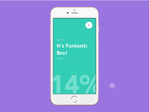
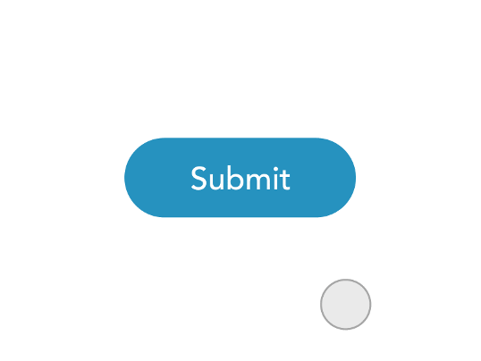
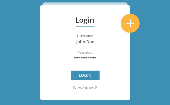
Ever been on a website and had a little “wow” moment when a link lit up as you hovered over it? Or maybe you've clicked a button, and it did a cute little dance or played a sound? Welcome to the world of micro-interactions! As we cruise into 2024, these tiny but mighty features are set to take center stage.
Think of micro-interactions as the unsung heroes of web design. They're like the sprinkles on your favorite dessert, adding that extra zing and making everything more delightful. These small touches guide users, spotlighting the cool stuff and making the whole online journey smoother and more enjoyable. But, just like with sprinkles, you don't want to go overboard. A dash here and there is perfect. So, if you're looking to sprinkle some magic onto your website, a handful of well-placed micro-interactions might be just the ticket!


5. AI Integration
Next up is the magic wand that will have a huge role in the future of modern website design: AI. And no, we're not talking about robots taking over the world. We're diving deep into how AI is revolutionizing the way websites interact with visitors. First up, personalized content. With AI, your website isn't just a static page; it's a dynamic space that tailors content to individual users. Imagine visiting a site that remembers your preferences and serves up content that's right up your alley. It's like walking into your favorite cafe, and the barista already knows your order.
Now, let's talk chatbots. These aren't your average “Hi, how can I help you?” bots. Custom chatbots powered by AI can answer complex queries, guide users, and even crack a joke or two, making customer interactions smooth and personable.
But the real game-changer? AI-driven content generators. Think of them as your website's secret weapon to attract customers. From crafting unique articles to developing free tools that users can't resist, these generators are gold for SEO. And the cherry on top? When your tools are so awesome, other sites can't help but link to them, giving you those valuable backlinks. So, if you're looking to make your website a magnet for users and links, AI's got the toolkit you need!
Some ideas for AI content generators:
- Resume generator
- Mortgage calculators
- Car value calculators
- Maintenance schedule planner
- Budget planner
- Tax estimators
- ROI calculators
- Social Media scheduler
- Profit calculators
- Currency converters
- Recipe generators
- Cost Calculators
- Workout plan generators
6. Storytelling
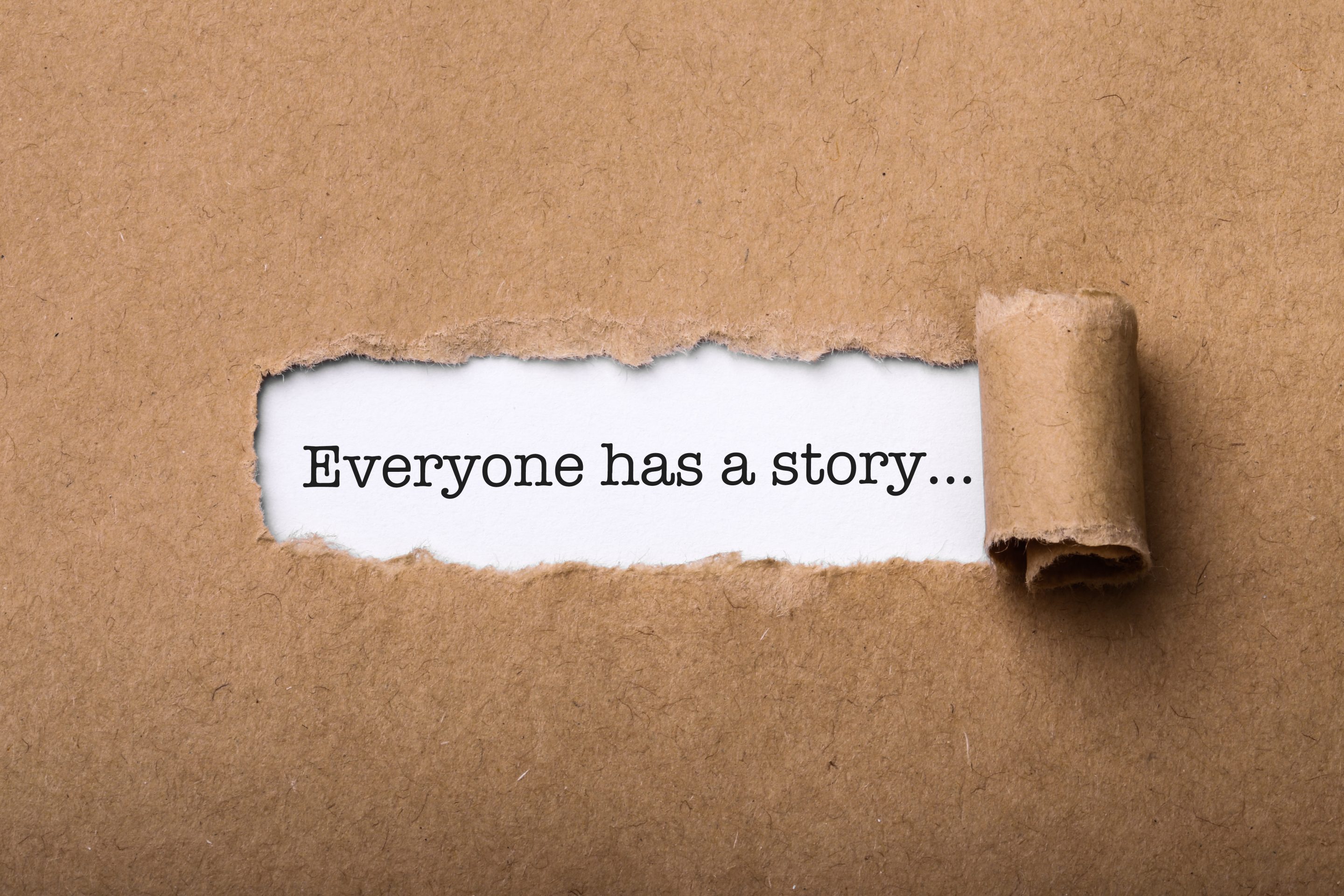
In today's fast-paced world, folks aren't just looking to buy stuff; they're hunting for stories, for connections, for that “feels right” moment. And guess what? Storytelling on your website is like handing them a golden ticket to an epic adventure. It's about taking your visitors on a rollercoaster of emotions, making them the hero of the tale, and showing them how your brand fits snugly into their narrative.
When spinning your web story, it's not about rattling off a laundry list of what you offer. Nah, it's about tapping into those feels, those “been there, done that” moments. And remember, less is often more. You don't want to drown folks in a sea of words. Spice up your narrative with some eye-catching visuals – think vibrant images, snazzy videos, or even a cool infographic. After all, a picture's worth a thousand words, especially when it's telling a story!
7. Thumb-Friendly Navigation
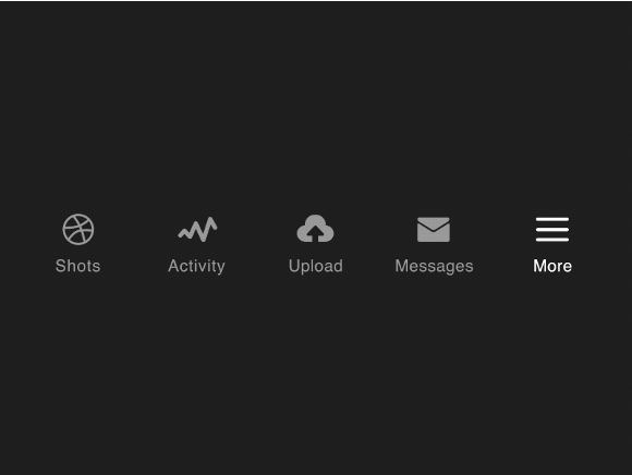
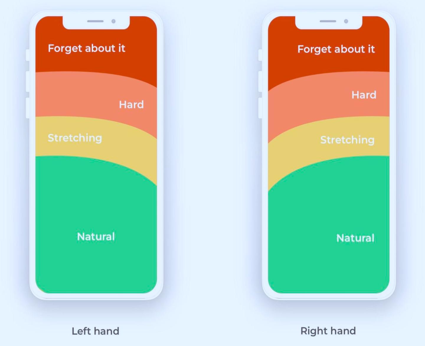
In today's mobile-centric world, thumb-friendly navigation is more than just a trend; it's a necessity. As we increasingly rely on our smartphones for browsing, the ease with which our thumbs can navigate a site becomes paramount. Thumb-friendly design ensures that key elements of a website are comfortably within reach of a user's thumb, making for a seamless browsing experience. This means strategically placing important buttons, links, and actions in areas easily accessible by the thumb. It's not just about convenience; it's about creating an intuitive user experience. As screen sizes grow and one-handed use remains a priority, ensuring your website caters to the thumb-scrolling majority is a design essential.
8. Large / Bold Typography
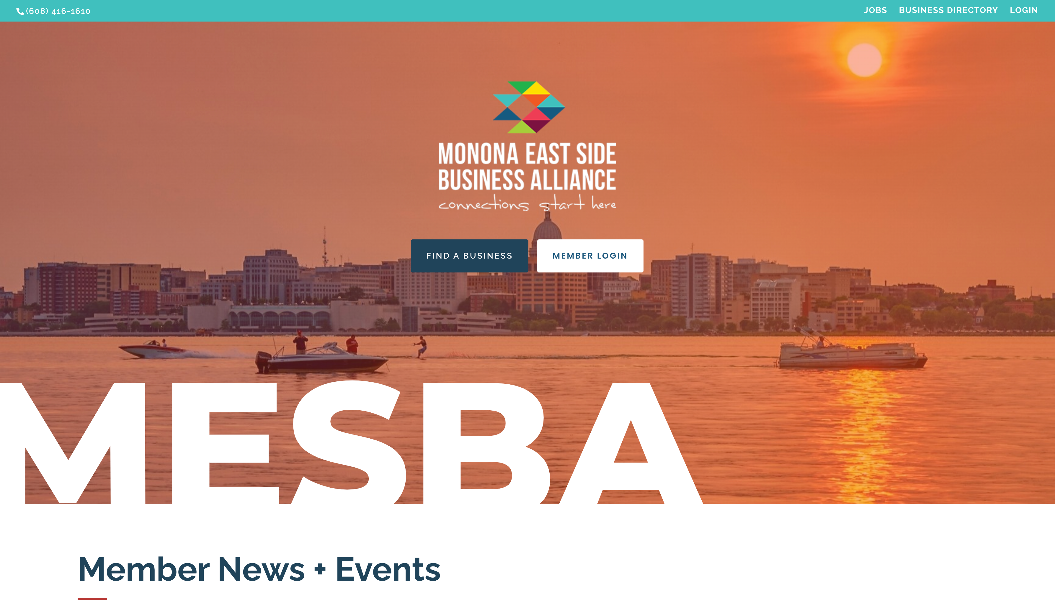
Bold typography in website design isn't just about making a statement; it's a strategic tool that guides a user's journey. In a digital world brimming with content, using pronounced fonts can help a site stand out, emphasizing key points and making content more digestible. With a plethora of typefaces available, designers can choose fonts that resonate with a site's ethos, be it vintage charm or modern minimalism.
However, the power of bold typography lies in its balanced use. Pairing it with simpler fonts ensures readability and avoids overwhelming the viewer. In essence, while bold fonts catch the eye, it's their thoughtful application that truly elevates a website's narrative and engages the audience.
9. Custom Illustrations and Data Visualization
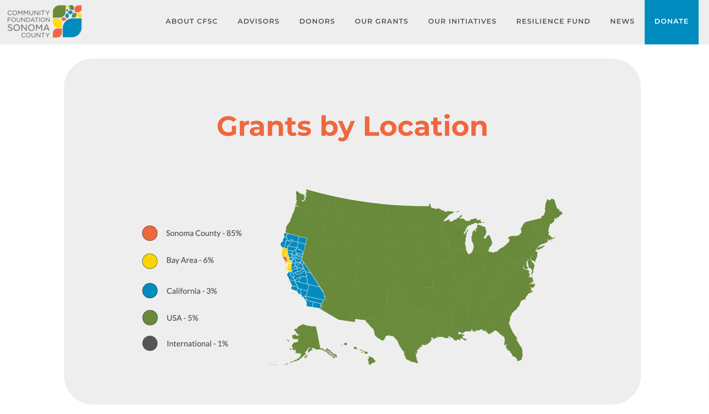
Custom illustrations have emerged as a powerful tool in the web design arsenal, offering a unique blend of personality and clarity that stock photos often can't match. In a digital landscape where many websites can feel eerily similar, these handcrafted visuals serve as a brand's fingerprint, giving it an unmistakable identity. They infuse a site with authenticity, ensuring that it feels less like a template and more like a thoughtfully curated digital space.
Beyond mere aesthetics, custom illustrations play a pivotal role in conveying complex information. Consider the rise of infographics, for instance. These visually engaging tools distill vast amounts of data into digestible, easy-to-understand visuals. They transform statistics and facts, which might be tedious in text form, into compelling stories that resonate with viewers. Similarly, product journey diagrams, crafted with custom illustrations, can guide potential customers through a product's lifecycle or its unique features, making the information more accessible and relatable.
In essence, custom illustrations do more than just beautify a website. They enhance user comprehension, foster deeper engagement, and serve as visual storytellers. Whether it's a whimsical touch on a homepage, a detailed infographic, or a comprehensive product journey diagram, these illustrations ensure that a website isn't just seen, but also remembered and understood.
10. Parallax Scrolling:
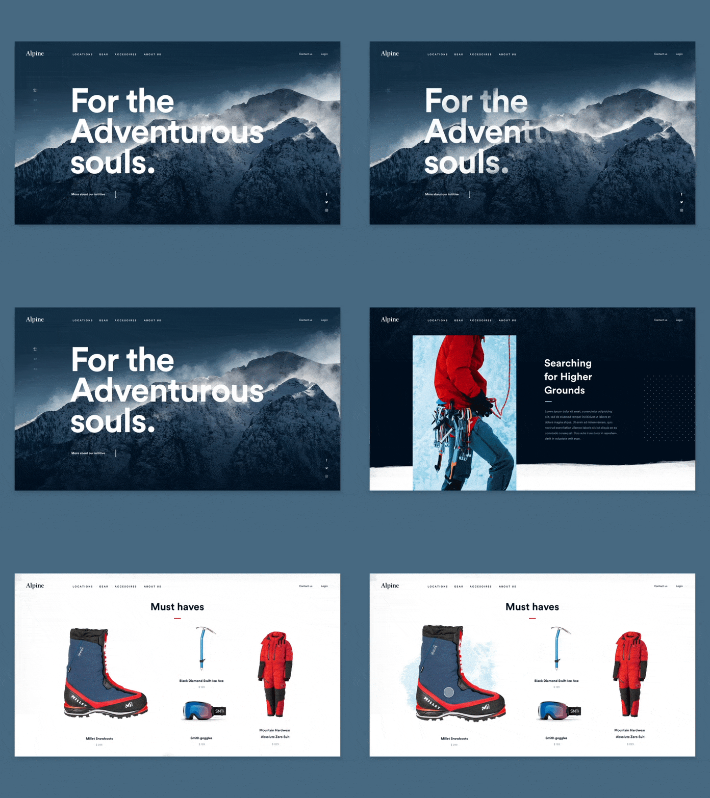
Ever scrolled through a website and felt like you were on a visual journey? That's the magic of parallax effects in web design! This isn't a new trend, but its popularity endures. Parallax creates a dynamic, multi-layered experience by making different elements on the page move at different speeds as you scroll. It's not just about aesthetics; it's about crafting a story and guiding your visitors through it. This immersive technique can make your content pop, drawing your audience deeper into your site. Whether it's a subtle shift in the background or a bold animation coming to life, parallax adds depth and dimension, turning an ordinary webpage into an interactive adventure.
Gearing Up for Your 2024 Digital Marketing Game Plan?
The digital landscape is buzzing as technology trends rapidly evolve, and business owners follow suit. These fresh trends and innovative approaches signal an exciting year ahead for web design! As we embrace these evolving styles and cutting-edge technologies, the opportunities to craft a captivating and informative website are vast. But remember, at the heart of every successful web design, lies a deep understanding of your audience's desires and needs. Staying tuned into the latest shifts in the industry ensures your website remains not just relevant, but a step ahead, delivering an unparalleled experience for every visitor.
Eager to kick off your web design strategy for 2024 and beyond? RAD Web Marketing's dedicated team of design professionals is here to craft a site that's not only visually stunning but also highly efficient. The next chapter of your online success is just a click away with RAD Web Marketing. Reach out and let's embark on this journey together!














0 Comments