Websites are the digital face of your business. With that in mind, it’s important they are well designed and easy to navigate. After all, if customers can’t find what they are looking for, they most likely won’t stick around for long.
UX (User Experience) Design is a field of design that focuses on creating an enjoyable user experience when visiting a website or using an application. UX Designers use various techniques to create websites that are user-friendly, intuitive and easy to navigate.
In this article, we will discuss some of the UX Design techniques used by designers to build easy-to-navigate websites and how you can apply these techniques to your own website.
Create Clear Site Structure and Navigation
The first step in designing a user-friendly website is creating a clear site structure and navigation system. This allows users to quickly find the information they need without getting lost or confused.
When designing your site structure, consider how users will interact with your content—what pages they will visit first, what pages should be grouped together, etc.—and create navigation menus accordingly. Make sure all menus are clearly labeled so users know where each page leads them when clicked on—generic terms such as “Products” or “Services” can be confusing for users who may not know what those terms mean in relation to your business specifically.
Additionally, keep menus short—too many options can overwhelm visitors and make it difficult for them to quickly find what they need. To avoid this issue, consider breaking up large menus into multiple smaller ones so the most important options stand out more easily on each page.
Implement Visual Cues
Visual cues are elements on your website that direct visitors towards areas you want them to explore further, such as product pages or signup forms. Common visual cues include arrows pointing in a specific direction or text boxes highlighting key information about a particular product or service offered by your business.
These visual cues help guide visitors through the site while also providing valuable information about products and services offered by the company without overwhelming the user with too much text at once—a great way of making sure visitors get all the info they need without becoming overwhelmed by it all at once!
Use Intuitive Interfaces
Intuitive interfaces allow users to easily complete tasks within an application or web page without needing any instructions or tutorials beforehand—and intuitive designs make it easier for users to understand how things work without having any prior knowledge about it either!
A good example of an intuitive interface is Apple’s iOS operating system: their design has been carefully crafted over time so interactions feel natural and logical even from first use – something which has helped them become one of today's leading technology companies! Additionally, many web applications like Dropbox offer onboarding tutorials which allow new users familiarize themselves with their interface faster than if there was no tutorial available at all – another great example of how intuitive interfaces can be beneficial!
Optimize Loading Times & Responsiveness
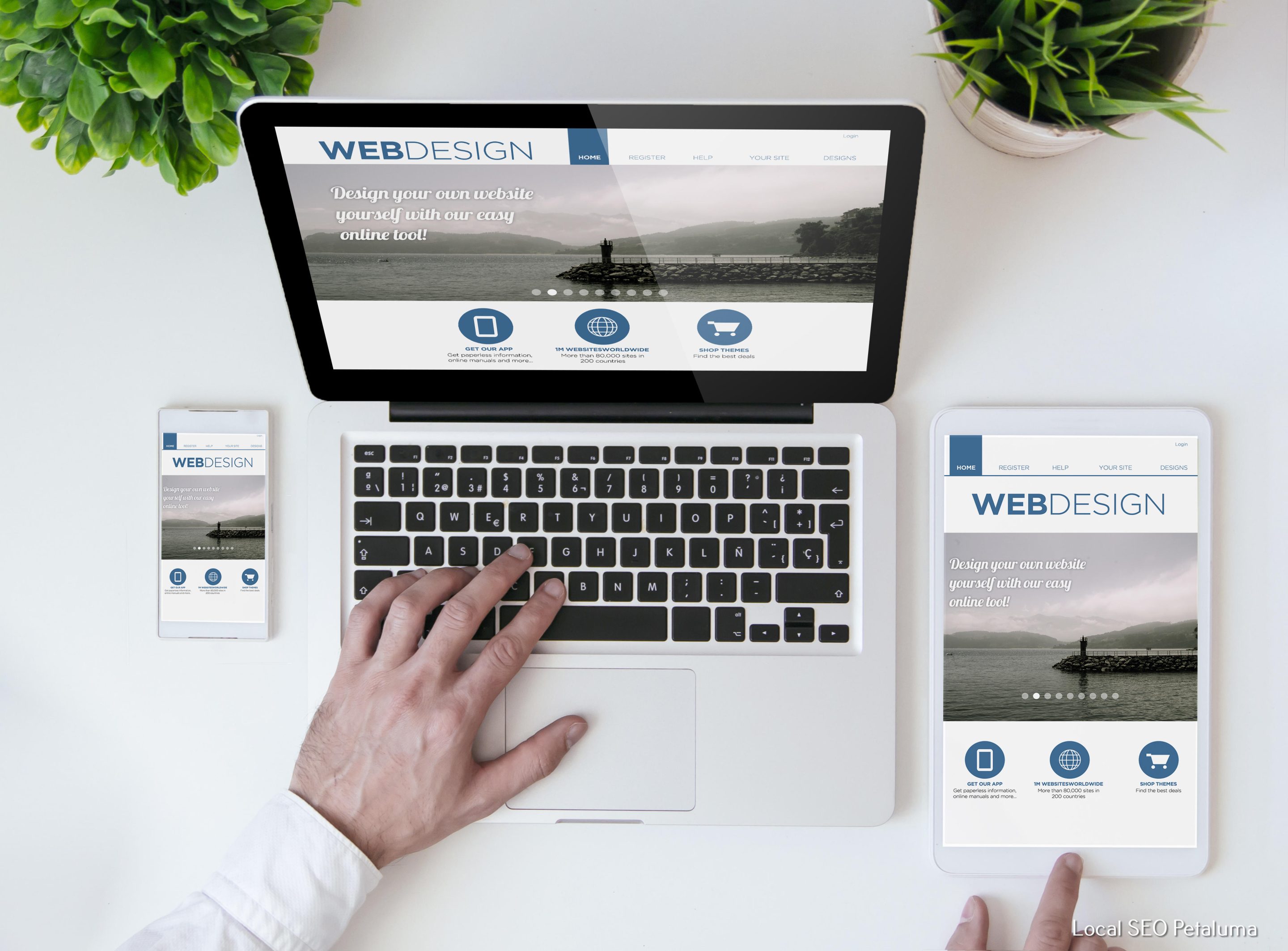
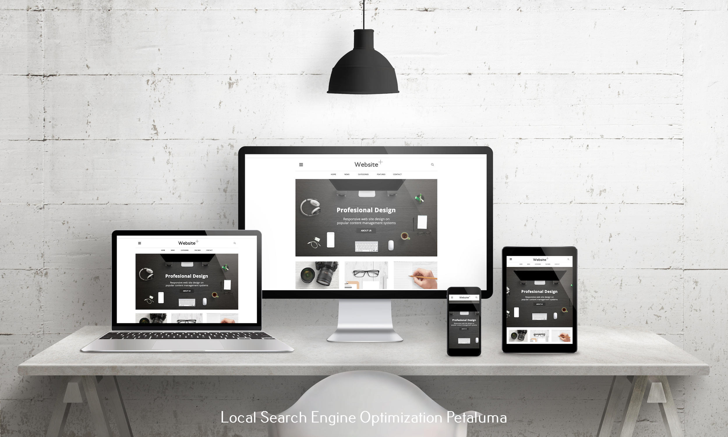
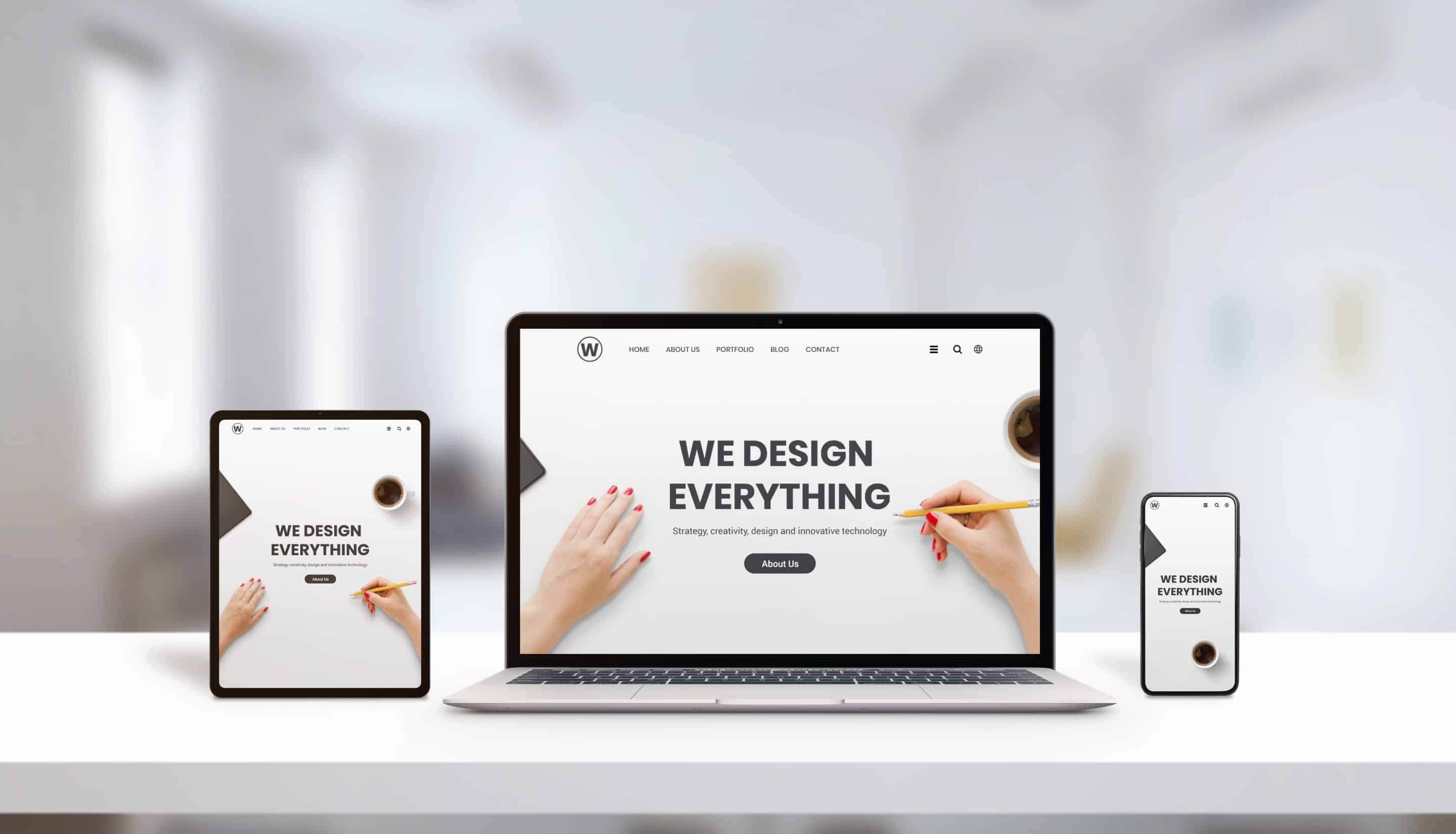
Nobody likes waiting around for pages to load – both slow loading times and poorly optimized sites can result in frustrated visitors leaving before ever seeing anything you have put together! This is why optimizing loading times & responsiveness is essential when making sure customers have an enjoyable experience navigating through our website – especially since most people now access sites from mobile devices as well as desktop computers!
To ensure fast loading times & responsive designs across different device types , developers should compress images before uploading them onto our webpages – this helps reduce file size drastically while still keeping quality intact; additionally , you should also try using caching plugins whenever possible which help speed up loading times even more – both these measures combined help ensure smooth browsing experiences regardless of device type used !
Keep Content Consistent Throughout Pages
Consistency helps create familiarity between different parts of our website – think about colors , font sizes , button shapes etc . All these elements should remain consistent throughout different pages , allowing people who have visited before recognize certain aspects which could then lead them towards specific products / services we offer . Additionally , consistency helps give off signals that everything belongs together rather than feeling like separate pieces randomly thrown together – giving off a more professional appearance overall !
Make Sure Everything Is Accessible For All Users
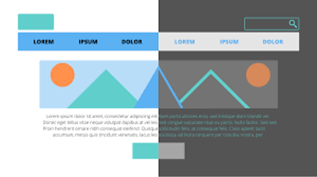
Last but not least , accessibility plays an important role when creating websites – after all , everyone should be able access our sites regardless if someone has vision impairments or just doesn't speak english very fluently . This is why features like high contrast mode which darken colors & increase font sizes come into play ; additionally audio descriptions & subtitles (for video content) could also be added depending on needs !
All these UX design techniques work together harmoniously with one another helping build easy-to-navigate websites that meet customers needs while providing pleasant experiences during their visits too ! By following these tips you'll have created something special – something that sets itself apart from competitors ensuring customers remember us positively after their visit .













0 Comments