Colors are all around us, influencing our emotions and behaviors in ways we may not even realize. In the world of web design, colors play a crucial role in creating a visually appealing and effective website. Understanding the psychology behind colors can give businesses an advantage in attracting and engaging their target audience. So let's dive into the fascinating world of color psychology in web design.
The Power of First Impressions
When it comes to websites, first impressions are everything. Studies have shown that it takes only 0.05 seconds for visitors to form an opinion about a website, and 94% of that opinion is based on its design. This means that before visitors even read any text or explore your services, they will have already formed an impression based on the colors used on your website.
Color has a significant impact on how people perceive a brand or company. It can evoke emotions, create associations, and even influence purchasing decisions. Therefore, choosing the right colors for your website is crucial in making a positive first impression and establishing trust with potential customers.
The Basics of Color Psychology
Before we delve into specific colors and their meanings, it's essential to understand some basic principles of color psychology.
Warm colors like red, orange, and yellow are energetic and attention-grabbing. They convey feelings of warmth, excitement, and passion.
On the other hand, cool colors like blue, green, and purple are calming and soothing. They evoke feelings of trustworthiness, reliability, and stability.
Neutral colors like black, white, gray are often used as background or accent colors to balance out more vibrant hues.
It's also worth noting that cultural backgrounds can influence how people perceive certain colors. For example, while red is associated with love and passion in Western cultures; it symbolizes luck in Chinese culture.
Using Color for Branding
Color plays a vital role in branding as it helps businesses create associations with their products or services. For example, think of fast-food chains like McDonald's and KFC, and the first colors that come to mind are yellow and red. These colors are known to stimulate appetite and create a sense of urgency, making them perfect for these types of businesses.
When choosing colors for your brand, consider your target audience and what emotions you want to evoke. If you're targeting a younger audience, brighter hues may be more effective in capturing their attention. On the other hand, if your target audience is more mature or professional, muted tones may be more appropriate.
Using Color in Web Design
Now that we understand some basics of color psychology let's explore how it can be applied in web design.
1. Create a Cohesive Color Scheme
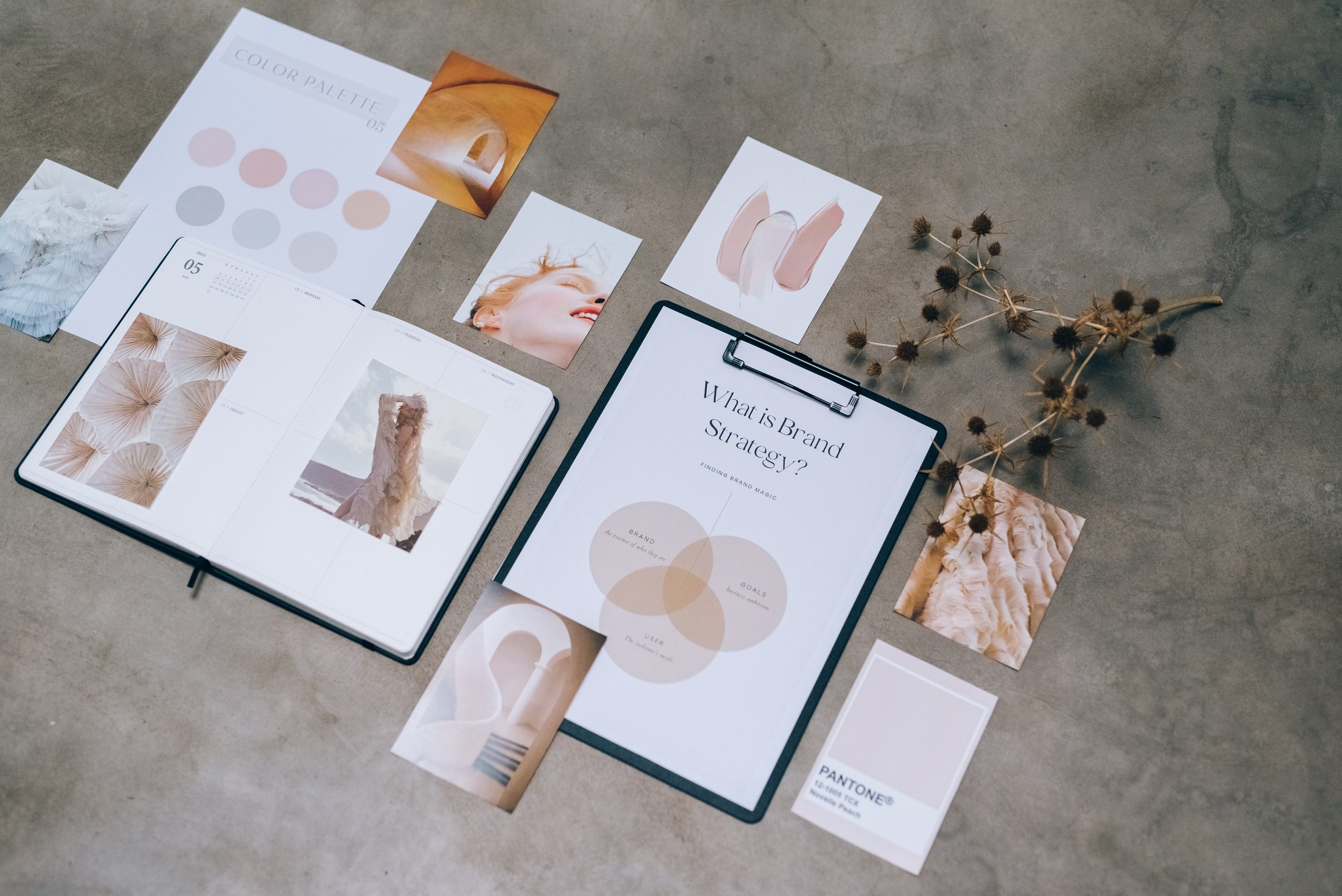
Consistency is key when it comes to using color in web design. Choose a color scheme that reflects your brand identity and stick with it throughout your website. This includes using the same shades of colors on different pages and elements to create a cohesive look.
2. Highlight Calls-to-Action
Calls-to-action (CTAs) are essential elements on a website as they guide visitors towards taking certain actions like making a purchase or filling out a form. To make them stand out, use contrasting colors that draw attention and encourage visitors to click on them.
3. Consider Cultural Influences
As mentioned earlier, different cultures have varying associations with colors. If your business caters to an international audience, it's crucial to research how certain colors may be perceived differently by people from different backgrounds.
4. Use Colors for Hierarchy
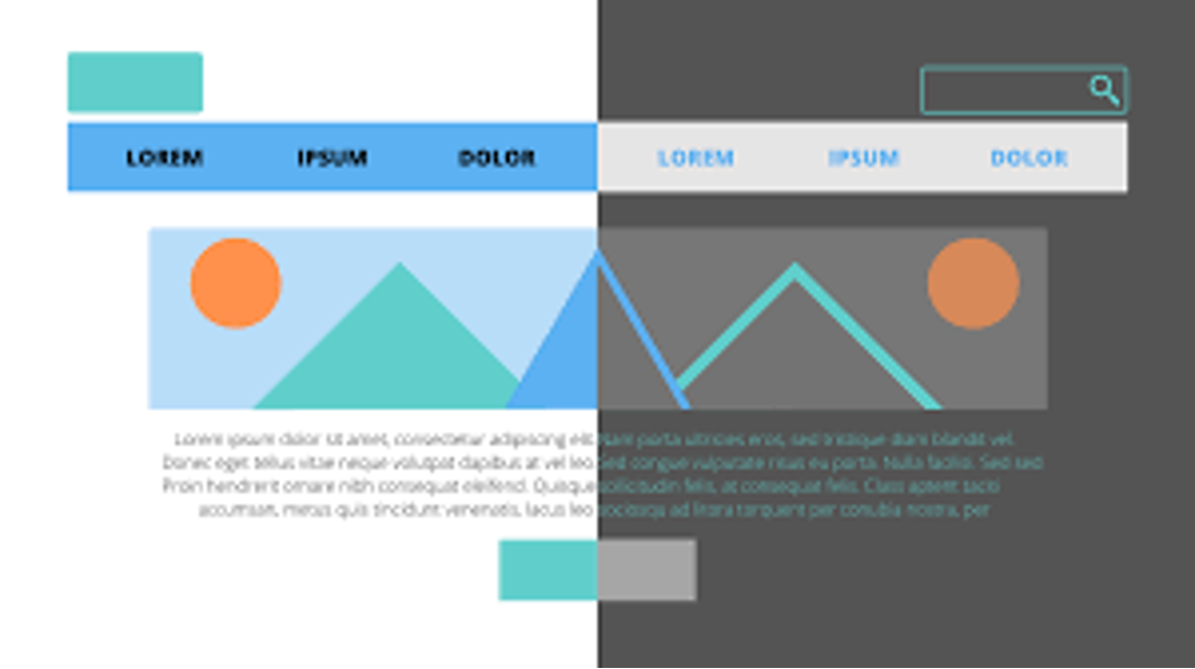
Color can also be used as an effective tool in creating visual hierarchy on a website. By using brighter or bolder hues for important information or headings, you can guide visitors' eyes towards where you want them to focus first.
5. Don't Overdo It
While using color is essential in web design, too many different colors can overwhelm visitors and distract from the main message. Stick to a few complementary colors and use them strategically to create an aesthetically pleasing and easy-to-navigate website.
In Conclusion
Color psychology plays a significant role in web design and can have a powerful impact on how visitors perceive your brand. By understanding the meanings and associations behind different colors, businesses can create visually appealing websites that effectively communicate their message and attract their target audience. So next time you're designing or revamping your website, remember to use color strategically to make a lasting impression.







0 Comments