The Power of Contrast: Implementing Color Theory for Improved Readability in Web Design
In today's digital world, it's not enough to simply have a website. With millions of websites competing for attention, it's crucial to have a visually appealing and user-friendly design that stands out from the rest. One way to achieve this is by implementing color theory in web design. By understanding the power of contrast, you can create a website that not only looks great but also improves readability and ultimately drives more conversions.
What is Color Theory?
Color theory is the study of how colors interact with each other and how they affect human emotions and behavior. It's a fundamental aspect of design that has been used for centuries by artists, designers, and marketers alike. In web design, color theory plays a crucial role in creating an effective visual hierarchy on a page.
The Importance of Contrast in Web Design
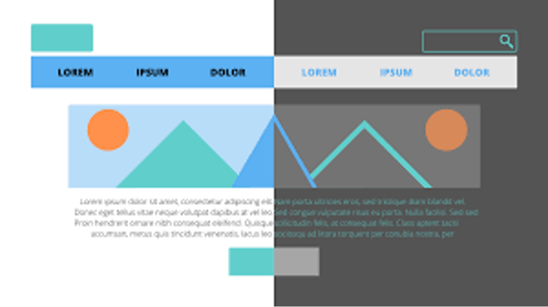
Contrast refers to the difference between two elements on a page, such as light vs dark or warm vs cool colors. In web design, contrast is essential because it helps guide the user's eye towards important elements on the page and creates visual interest. Without enough contrast, your website may look dull or confusing to users.
Improving Readability with Contrast
One of the primary goals of web design is to make information easily accessible to users. If your website has poor readability, visitors may quickly become frustrated and leave without taking any action. This is where contrast comes into play.
High contrast between text and background can significantly improve readability for users. For example, using black text on a white background creates maximum contrast and makes it easier for readers to consume information quickly. On the other hand, using light grey text on a white background can strain the eyes and make it challenging to read.
When choosing colors for your website's text and background, be sure to consider their contrast levels carefully. Tools like Adobe Color or Coolors can help you find complementary colors with the right amount of contrast.
Creating a Visual Hierarchy
In web design, visual hierarchy is crucial in guiding users towards the most important elements on a page. By using contrast, you can create a clear visual hierarchy that helps users navigate your website and find what they're looking for quickly.
One way to achieve this is by using high-contrast colors for call-to-action buttons. For example, if your website's primary color scheme is blue, consider using a bright orange or yellow for your call-to-action buttons. The high contrast between these colors will make the button stand out and increase the chances of it being clicked.
Another way to use contrast to create visual hierarchy is by playing with text sizes and weights. Using larger and bolder text for headings and subheadings can help break up content and make it easier to scan. However, be sure not to overdo it as too much contrast in text can also be overwhelming for users.
Using Color Psychology
Color psychology is another essential aspect of color theory that can influence how users perceive your website. Different colors evoke different emotions and behaviors in people, so it's crucial to choose them carefully.
For example, warm colors like reds, oranges, and yellows are known to stimulate appetite and grab attention. This is why many food-related websites use these hues in their designs. On the other hand, cool colors like blues and greens are associated with calmness and trustworthiness, making them ideal for financial or healthcare websites.
When implementing color psychology in web design, be sure to consider your target audience's preferences as well as the message you want to convey through your website.
Conclusion
Incorporating color theory into your web design can have a significant impact on how users perceive your website. By understanding the power of contrast and its role in improving readability and creating visual interest, you can create a more effective website that drives conversions. So the next time you're designing a website, remember to play with contrast and color to make your website stand out in the crowded digital landscape.












0 Comments