In today’s digital age, businesses are increasingly relying on mobile web design to reach customers. With more people relying on their phones for their daily needs, it is crucial to ensure that users have an optimal experience when they visit your website. If your website fails to provide a great user experience, you will lose potential customers and suffer from reduced sales or revenue.
Fortunately, there are several ways to optimize user experience for mobile web design. By incorporating these strategies into your mobile design process, you can deliver an enjoyable and successful web experience for all of your visitors.
Pay Attention to Design
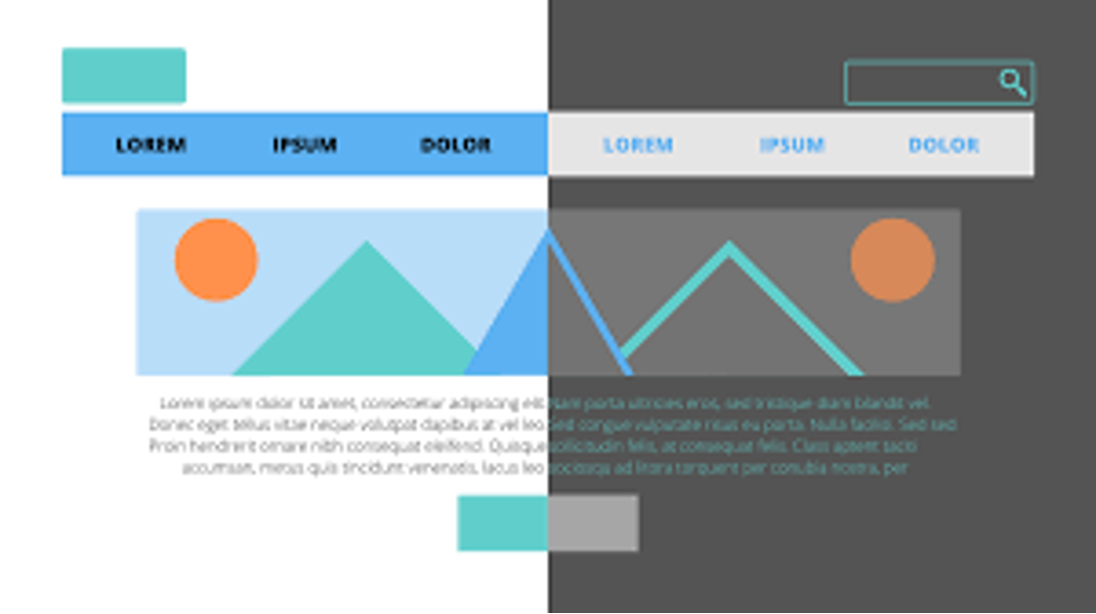
The first step in optimizing user experience is paying attention to the overall design of your site. Mobile sites should be designed with a minimalist approach so they can be easily navigated on small screens without compromising the visual appeal of the site. The key elements of a successful mobile design include:
• A clean layout that emphasizes the most important content and features first
• Minimal animation or images that don’t slow down loading times
• Intuitive navigation that allows users to easily find what they need
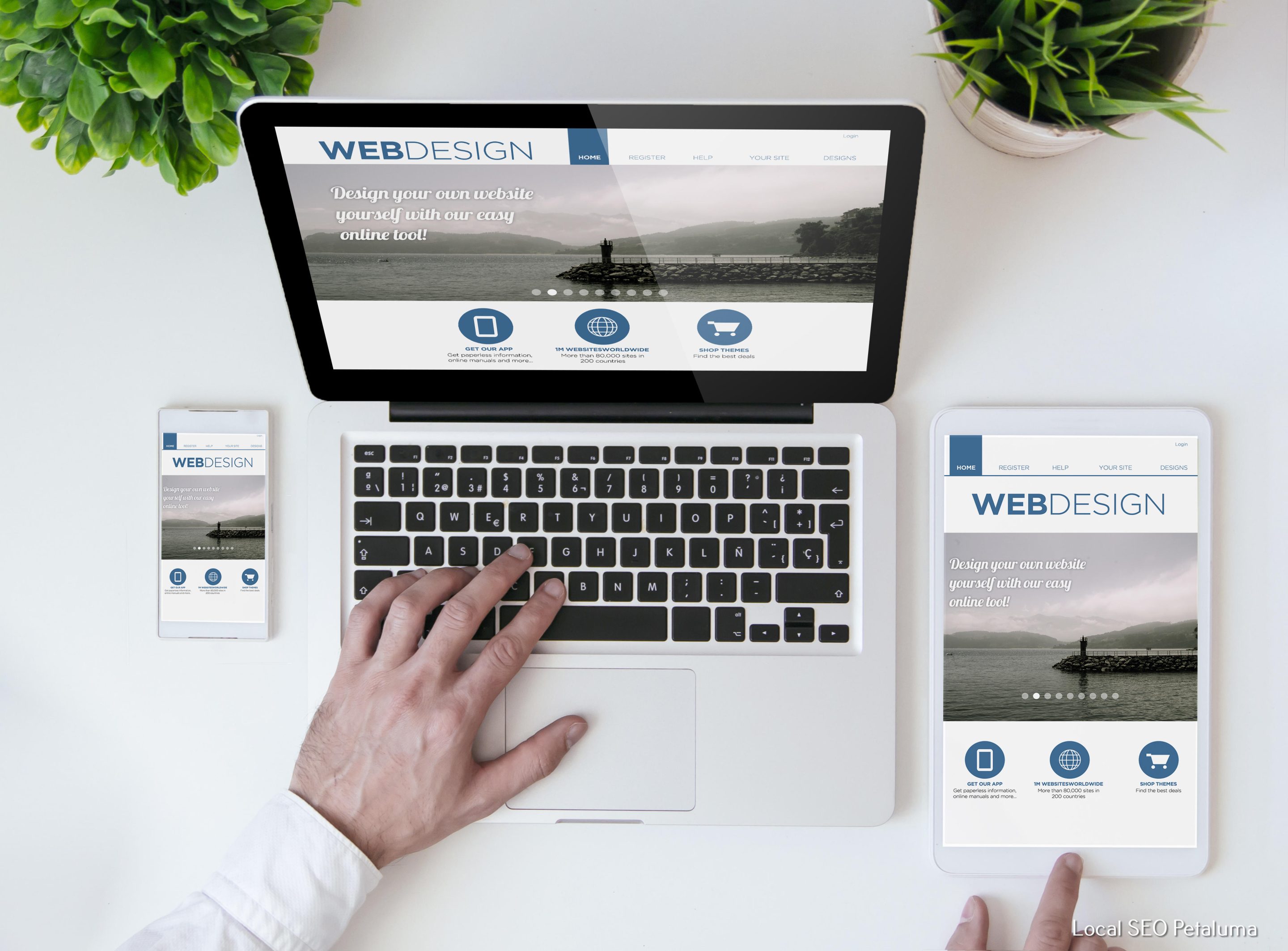
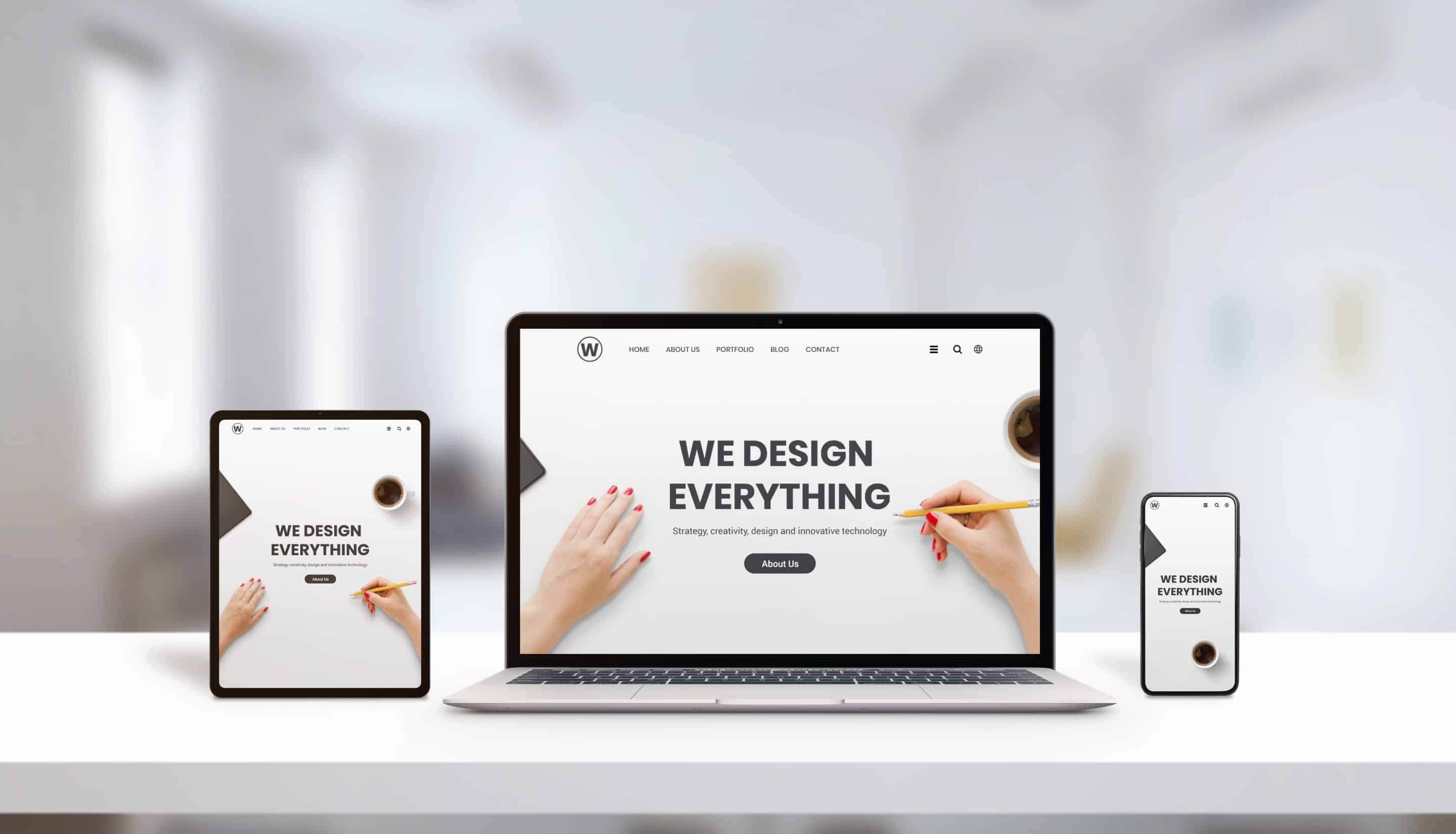
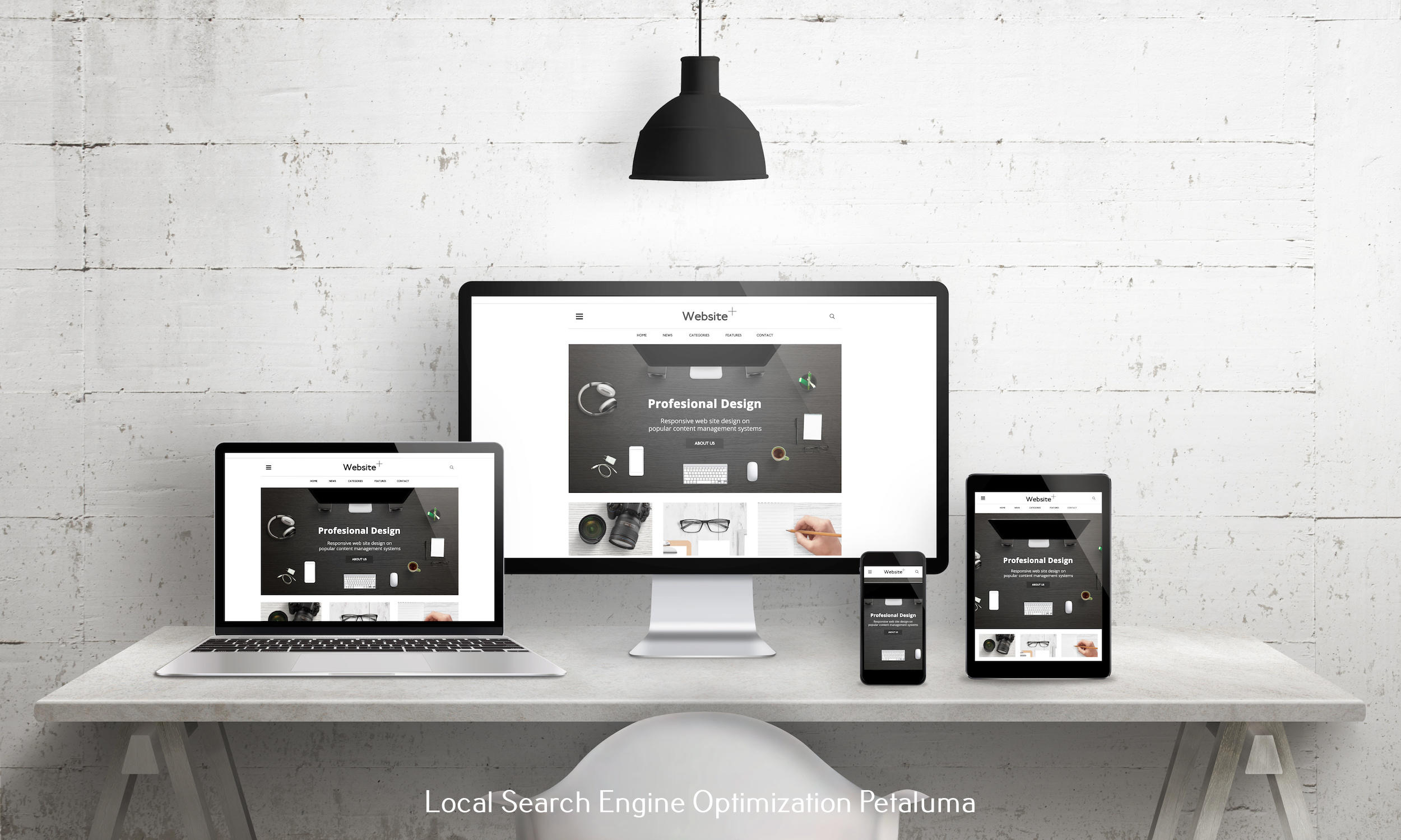
• Responsive design that looks good on all screen sizes and devices
Focus on Performance
The second step in optimizing user experience for mobile web design is ensuring that the site performs well across all platforms. This includes making sure pages load quickly and efficiently, eliminating any lags or delays that could impact a user’s ability to find what they need quickly and easily. Additionally, you should make sure that pages are optimized for different devices so users don’t have to pinch or zoom in order to view content properly. Finally, test out different browsers (Chrome, Safari) and operating systems (iOS/Android) before launch so you can guarantee compatibility with as many devices as possible.
Simplify Navigation
Navigation is another important element of optimizing user experience for mobile web design. Your goal should be to make it as easy as possible for users to find what they need without having to click through multiple pages or scroll endlessly down long ones filled with too much text or images. This means utilizing simple menus with drop-down menus where appropriate; using text links instead of buttons; keeping titles concise; limiting pop-ups; avoiding auto-play videos; utilizing shortcuts like breadcrumbs mapping out where visitors have been; and providing clear calls-to-action at the end of each page so they know exactly how to take action if desired (e.g., “Sign up now!”).
Optimize Forms & Inputs
Finally, when it comes time for a visitor fill out forms or input information into your website (e.g., password fields), take extra care in optimizing this process as well by making sure fields are clearly labeled; input boxes are large enough; autocomplete options are enabled when applicable; errors are clearly highlighted red if incorrect data has been entered; password strength indicators exist if needed; etc.. All these measures help reduce frustration while also increasing accuracy—which ultimately leads to improved user satisfaction rates across all platforms and devices!
Conclusion
Optimizing user experience for mobile web design requires attention not only aesthetic appeal but also performance factors such as page speed and loading times along with navigational elements like simplified menus & dropdowns plus optimized forms & inputs which increase accuracy while decreasing frustration levels from visitors trying access content from their smartphones & tablets – enabling businesses everywhere benefit from increased sales & revenue due offering ideal experiences no matter which device potential customers may be using!












0 Comments