Optimizing Landing Pages for Conversions: Best Practices and Case Studies
As a business owner, you know the importance of having a strong online presence. In today's digital age, having a website is not enough. You need to have a well-optimized landing page that can convert visitors into leads or customers. In this article, we will discuss the best practices for optimizing landing pages and provide real-life case studies to demonstrate their effectiveness.
Understanding Landing Pages
Before we delve into the best practices, it's important to understand what landing pages are and their purpose. A landing page is a standalone web page designed specifically for marketing or advertising campaigns. Its main goal is to capture the visitor's attention and persuade them to take action, such as filling out a form or making a purchase.
Landing pages are different from other web pages because they have one specific focus and are free from any distractions like navigation bars or links to other pages. This allows visitors to focus solely on the offer or call-to-action (CTA) without getting distracted.
Now that we have established what landing pages are let's look at some best practices for optimizing them.
1. Create an Attention-Grabbing Headline
The first thing visitors see when they land on your page is the headline. It needs to be attention-grabbing and convey your message clearly and concisely. Your headline should also be aligned with your ad copy or email subject line that brought the visitor to your page in the first place.
For example, if you're running an ad for a 20% off discount on your products, make sure your headline reflects this offer. This will create consistency and trust with the visitor, increasing the chances of them converting.
2. Keep Your Design Simple
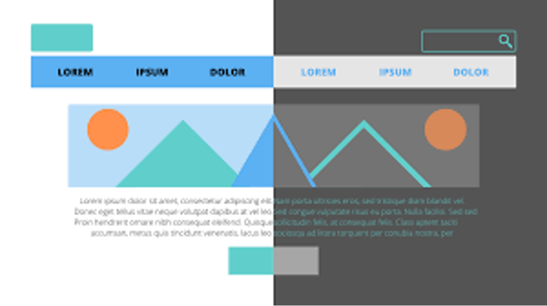
When it comes to landing page design, simplicity is key. Avoid cluttering your page with too many elements as it can be overwhelming for visitors and distract them from taking action. Stick to a clean and minimal design that highlights your offer or CTA.
Use high-quality images or videos that are relevant to your offer and help convey your message. Keep in mind that visual content can be more effective in capturing attention than plain text.
3. Have a Clear Call-to-Action
The purpose of a landing page is to get visitors to take a specific action, whether it's filling out a form, signing up for a free trial, or making a purchase. Your call-to-action should be clear, prominent, and persuasive.
Use action-oriented words like “get started,” “claim now,” or “learn more” to encourage visitors to take the desired action. Also, make sure your CTA stands out from the rest of the page by using contrasting colors or bold fonts.
4. Use Social Proof
In today's digital world, people are more likely to trust recommendations from others rather than businesses themselves. This is where social proof comes into play.
Social proof includes customer reviews, ratings, testimonials, and social media shares that demonstrate the value and credibility of your business. Including these elements on your landing page can help build trust with visitors and increase conversions.
5. Optimize for Mobile Devices
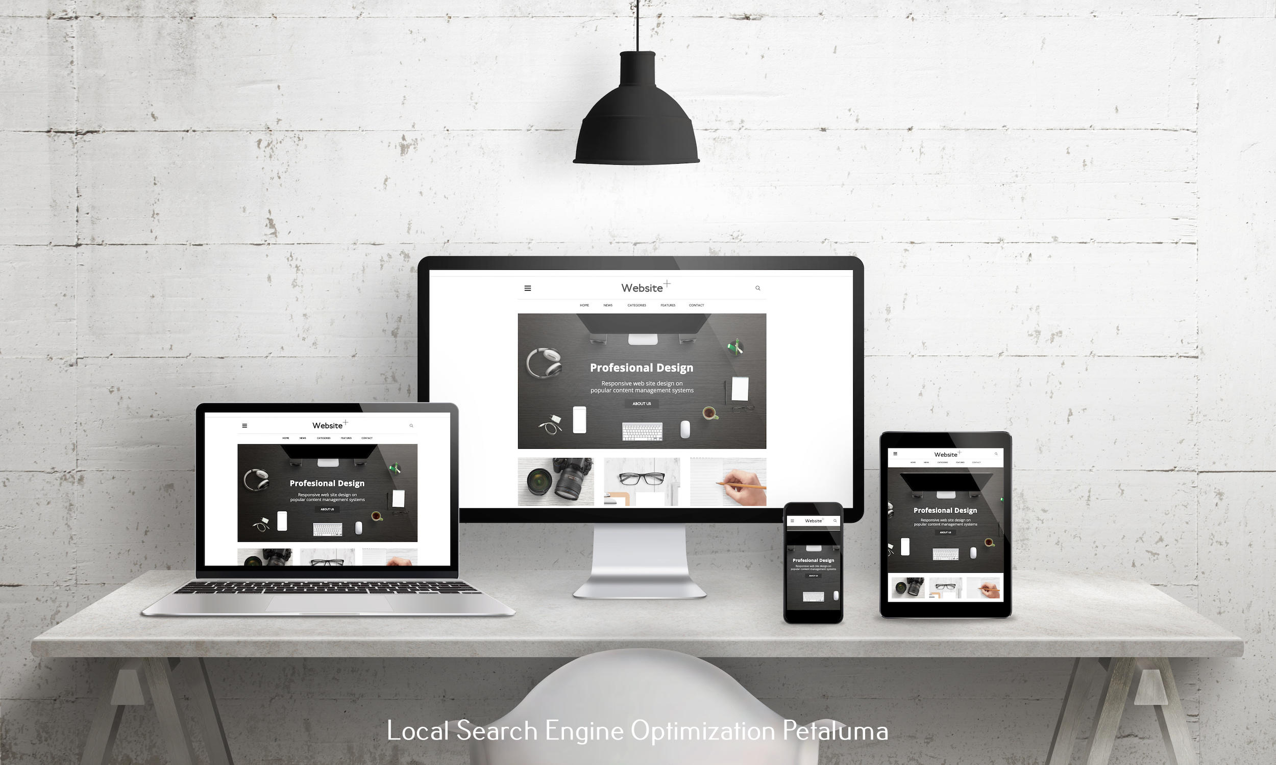
With the majority of internet users browsing on their mobile devices, it's crucial to optimize your landing pages for mobile as well as desktop users. Make sure your page is responsive and loads quickly on all devices.
Also, consider the differences between desktop and mobile user behavior when designing your landing page. For example, mobile users may prefer scrolling over clicking multiple buttons while desktop users may prefer clicking through different sections of the page.
Case Studies: Real-Life Examples of Successful Landing Pages
Now that we have covered some best practices let's look at some real-life examples of how optimizing landing pages can lead to successful conversions.
1. Airbnb – Simplified Sign-Up Process
Airbnb redesigned their sign-up process with a simple, one-field form that only required an email address and password. This resulted in a 30% increase in conversions and a whopping $12 million revenue increase.
By simplifying the sign-up process, Airbnb removed any barriers for potential users to join their platform, making it easier and more enticing for them to convert.
2. Dropbox – Use of Social Proof
Dropbox's landing page is a great example of using social proof to drive conversions. They prominently display logos of well-known companies that use their service, along with customer testimonials.
These elements help build trust with potential customers and showcase the reliability and value of Dropbox's services. This has contributed to their success as one of the most popular cloud storage platforms.
3. HubSpot – Personalized Call-to-Action
HubSpot's landing page for their free CRM software uses personalization to appeal to different audiences. Depending on the user's industry, the CTA will change from “start now” to “get started” or “download.”
This personalized approach makes visitors feel like HubSpot understands their needs and offers a solution tailored specifically to them. This has led to an impressive 55% conversion rate on this landing page.
Conclusion
Optimizing your landing pages is crucial for driving conversions and achieving your business goals. By implementing best practices such as creating attention-grabbing headlines, keeping your design simple, using clear CTAs, incorporating social proof, and optimizing for mobile devices, you can see significant improvements in your conversion rates.
Remember to always test different elements on your landing pages to see what works best for your audience. And don't forget about tracking your results so you can continue optimizing and improving your landing pages over time.
So go ahead and put these best practices into action on your own landing pages and watch as they become powerful tools for converting visitors into leads or customers!


0 Comments