Navigating the Complexities of Accessibility in UX Design: Best Practices and Considerations
As technology continues to advance, the importance of accessibility in UX design has become more prevalent than ever before. With the rise of digital products and services, it is crucial for businesses to ensure that their websites and applications are inclusive and accessible to all users. This not only benefits individuals with disabilities but also creates a positive user experience for everyone. In this article, we will explore best practices and considerations for creating an accessible UX design.
Understanding Accessibility in UX Design
Before diving into best practices, it is important to understand what accessibility means in the context of UX design. Simply put, accessibility refers to designing products or services that can be used by individuals with disabilities without any barriers. This includes visual impairments, motor disabilities, cognitive disabilities, and more.
When it comes to UX design, accessibility means creating a user interface that is easy to use and navigate for all users regardless of their abilities. This involves considering various aspects such as color contrast, font size, keyboard navigation, screen readers and more.
Best Practices for Creating an Accessible User Experience
1. Prioritize Color Contrast
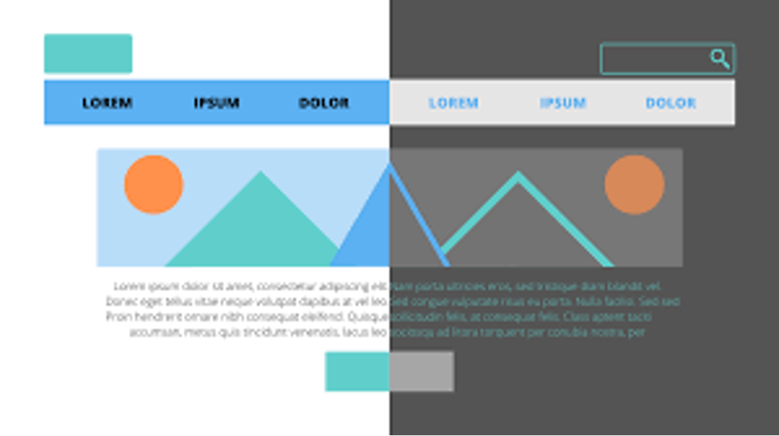
Color plays a crucial role in web design as it helps guide users through the interface. However, for individuals with visual impairments such as color blindness or low vision, certain color combinations can be difficult to distinguish. To ensure an accessible design for all users, it is essential to consider color contrast when choosing colors for your website or application.
A good rule of thumb is to have a minimum contrast ratio of 4.5:1 between text and its background. You can use tools like WebAIM's Color Contrast Checker or Adobe Color CC to test your color combinations before implementing them.
2. Use Clear and Readable Fonts
In addition to color contrast, font choice also plays a significant role in creating an accessible user experience. Fonts that are too small or too fancy can be difficult to read, especially for individuals with visual impairments. Therefore, it is best to use clear and readable fonts such as sans-serif or serif fonts in a minimum size of 14pt.
It is also important to consider the spacing between letters and lines of text. A line spacing of 1.5 or more can make it easier for individuals with dyslexia or other reading disabilities to navigate through the content.
3. Implement Keyboard Navigation
Not all users have the ability to use a mouse, which is why keyboard navigation is crucial for an accessible design. This means ensuring that all elements on your website or application can be accessed and interacted with using only a keyboard.
To achieve this, make sure that all clickable elements are highlighted when navigating using the Tab key. Also, avoid using hover effects as they can be difficult for keyboard-only users to access.
4. Provide Alternative Text for Images
Images are an integral part of web design, but they can also pose challenges for individuals with visual impairments. To make your design more inclusive, it is important to provide alternative text (alt text) for images so that screen readers can describe them accurately.
When writing alt text, make sure to be descriptive and provide context rather than just stating what the image looks like. This not only benefits visually impaired users but also helps with SEO (search engine optimization).
5. Make Videos Accessible
Videos have become a popular medium for conveying information on websites and applications. However, they can be inaccessible for individuals who are deaf or hard of hearing without proper captions or transcripts.
To ensure accessibility, provide closed captions or transcripts for all videos on your website or application. You can also include audio descriptions for visually impaired users who may not be able to see what is happening in the video.
Considerations when Designing an Accessible UX
In addition to best practices, there are some considerations that need to be kept in mind when designing an accessible user experience.
1. Keep it Simple
Simplicity is key when it comes to creating an accessible design. Avoid using too many colors, fonts, and animations as they can be overwhelming for individuals with cognitive disabilities. Stick to a clean and minimalistic design that is easy to navigate.
2. Test Your Design
It is important to test your design with real users who have disabilities to ensure that it is truly accessible. There are organizations and tools available that can help you conduct accessibility testing, such as the Web Accessibility Initiative (WAI) or UserTesting's accessibility feature.
3. Continuously Update and Improve
Technology is constantly evolving, and so are accessibility guidelines and standards. It is essential to continuously update and improve your design to meet the latest standards for accessibility.
In conclusion, creating an accessible UX design requires a conscious effort and consideration for all users regardless of their abilities. By following best practices and keeping these considerations in mind, businesses can create inclusive designs that benefit everyone.
At RAD Web Marketing, we understand the importance of accessibility in UX design and strive to create inclusive designs for our clients in North Bay, CA as well as Sonoma County. Contact us today to learn more about our digital marketing services!













0 Comments