As the internet and technology continue to evolve, the way we consume information also changes. With the rise of mobile devices and tablets, it is now more important than ever to ensure that your website is optimized for different screen sizes. This includes not only text and layout but also images. In this article, we will discuss how to optimize images for responsive design on different devices.
Understanding Responsive Design
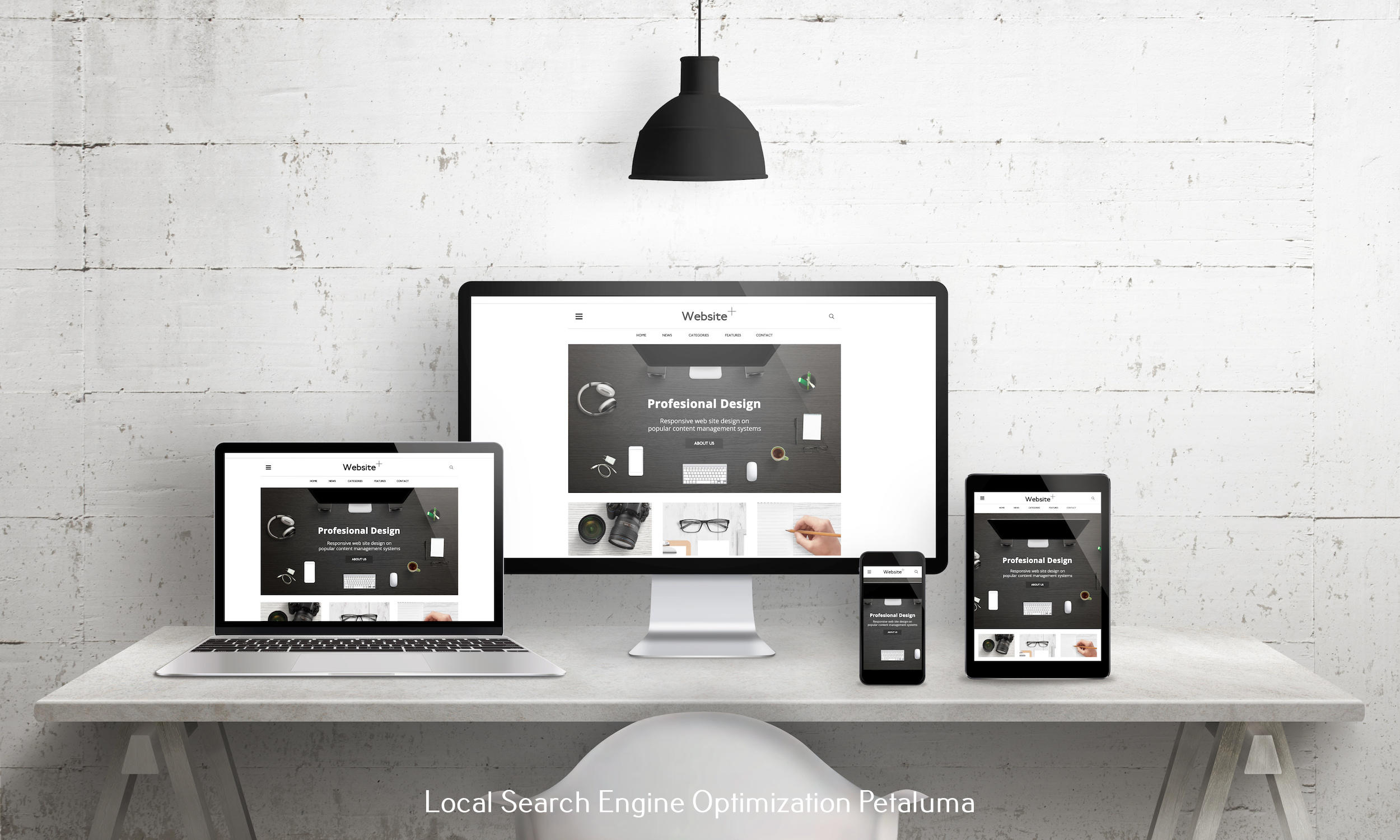
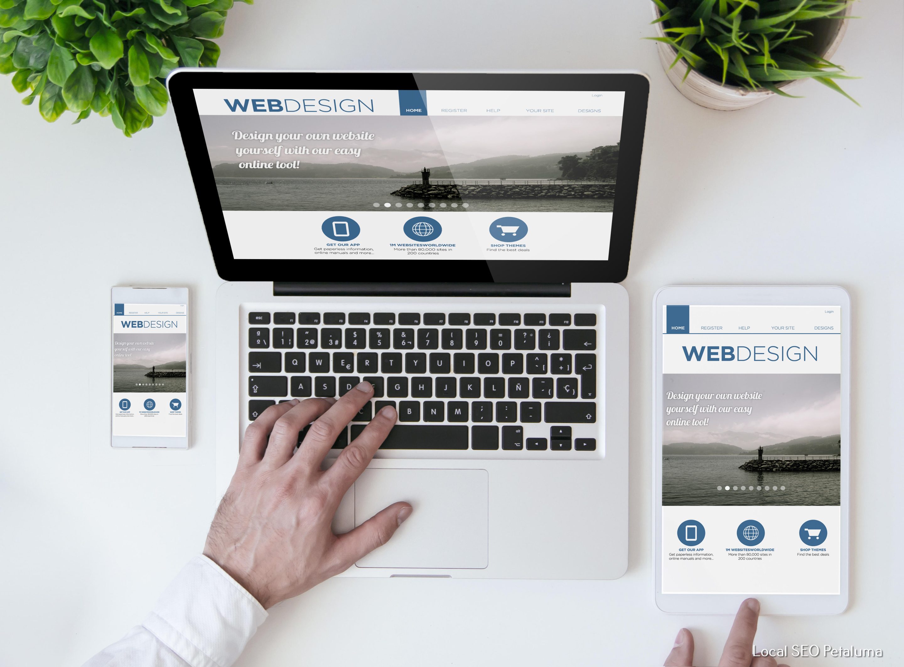
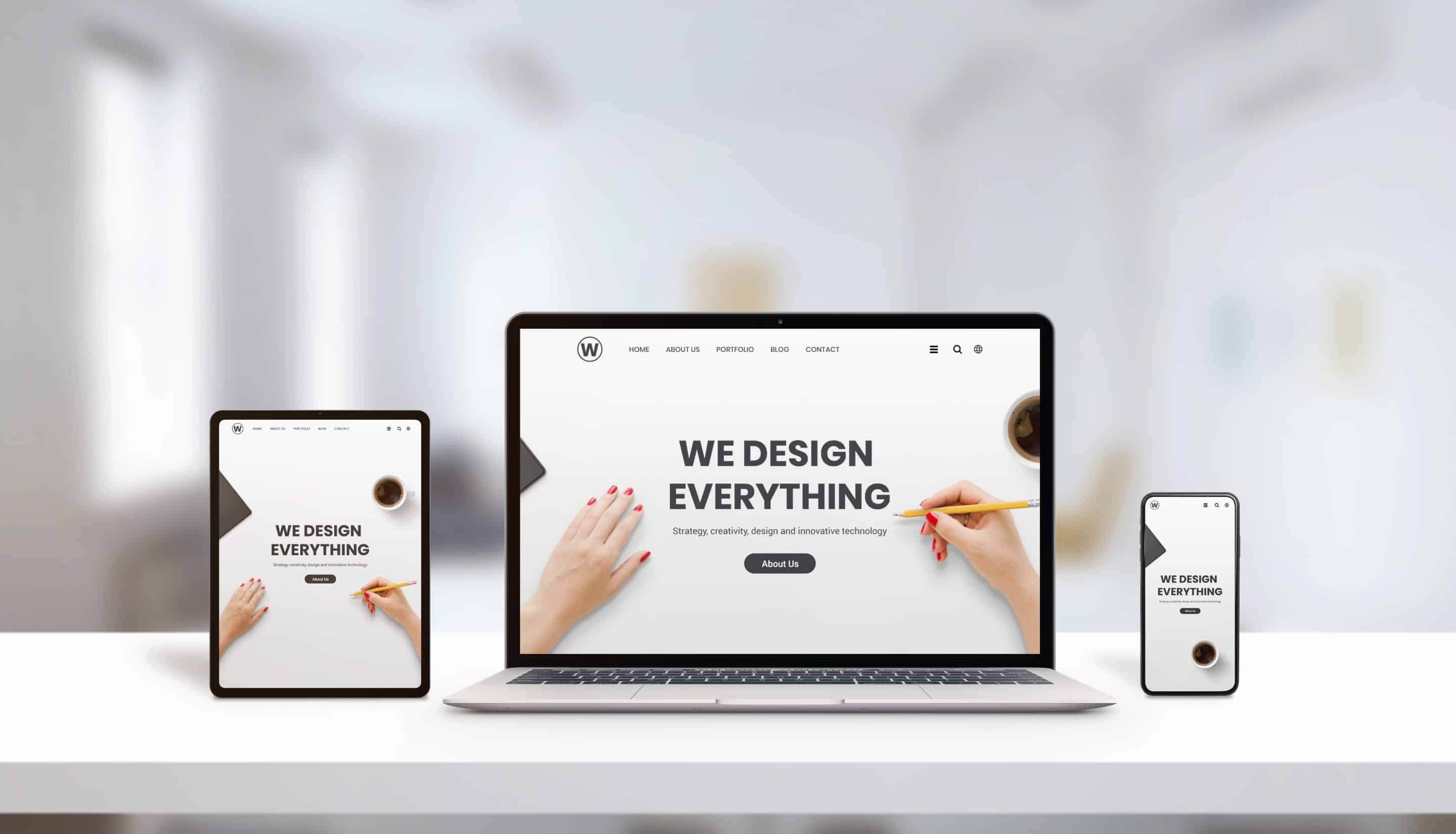
Before we dive into optimizing images for responsive design, let's first understand what responsive design is. Simply put, responsive design is an approach to web design that ensures a website's content adapts and responds to the size of the device it is being viewed on. This means that whether someone accesses your website on a desktop computer or a smartphone, they will have an optimal viewing experience.
Why Optimizing Images for Responsive Design Matters
Images play a crucial role in creating an engaging and visually appealing website. However, if not optimized properly, they can slow down your site's loading time and negatively impact user experience. With more people accessing websites through their mobile devices, optimizing images for responsive design has become essential.
How to Optimize Images for Responsive Design
1) Choose the Right Image Size
The first step in optimizing images for responsive design is choosing the right size. It's important to remember that larger images take longer to load and can cause your site to appear sluggish on smaller devices with slower internet connections. Therefore, it's best practice to use smaller image sizes without compromising quality.
One way to achieve this is by using image compression tools such as TinyPNG or JPEGmini which reduce file sizes without affecting image quality significantly.
2) Utilize CSS Media Queries
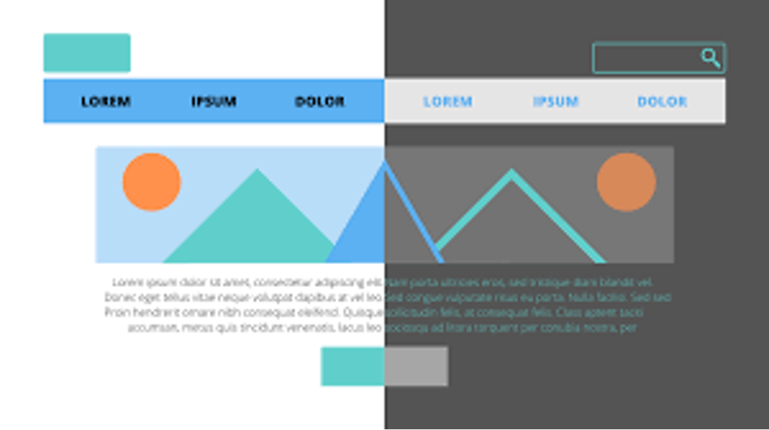
CSS media queries allow you to specify different styles for different screen sizes. By using these queries in conjunction with specific image dimensions, you can ensure that your images appear optimized on all devices.
For example, if you have an image that looks great on desktop but appears too large on a smartphone, you can use CSS media queries to change the image's size and aspect ratio for smaller screens.
3) Implement Lazy Loading
Lazy loading is a technique that allows images to load only when they are visible to the user. This means that images below the fold will not be loaded until the user scrolls down to them. This can significantly improve page loading times and overall user experience.
Many content management systems (CMS) and plugins have built-in lazy loading features, but there are also standalone tools such as Lazy Load by WP Rocket that can be installed on any website.
4) Use Vector Images
Vector images are created using mathematical equations rather than pixels. This means they can be scaled without losing quality, making them perfect for responsive design. Unlike raster images (JPEGs and PNGs), which become pixelated when enlarged, vector images remain crisp and clear regardless of size.
5) Test Across Devices
Finally, it's crucial to test your website across different devices to ensure everything appears as intended. While there are many online tools available for testing responsive design, nothing beats testing on actual devices.
Conclusion
Optimizing images for responsive design is essential in today's digital landscape. By choosing the right image size, utilizing CSS media queries, implementing lazy loading, using vector images, and testing across devices, you can ensure that your website looks great and performs well on all screen sizes. Don't neglect this crucial aspect of website design and keep your visitors engaged no matter what device they use.

























0 Comments