The world of digital marketing is a tricky one. With so many different ways to reach your target audience, it can be difficult to know where to start, especially when it comes to maximizing the conversion rate of your website’s landing page.
Fortunately, there are a few creative strategies you can implement that will help you optimize your landing page for maximum conversions. Here’s what you need to know:
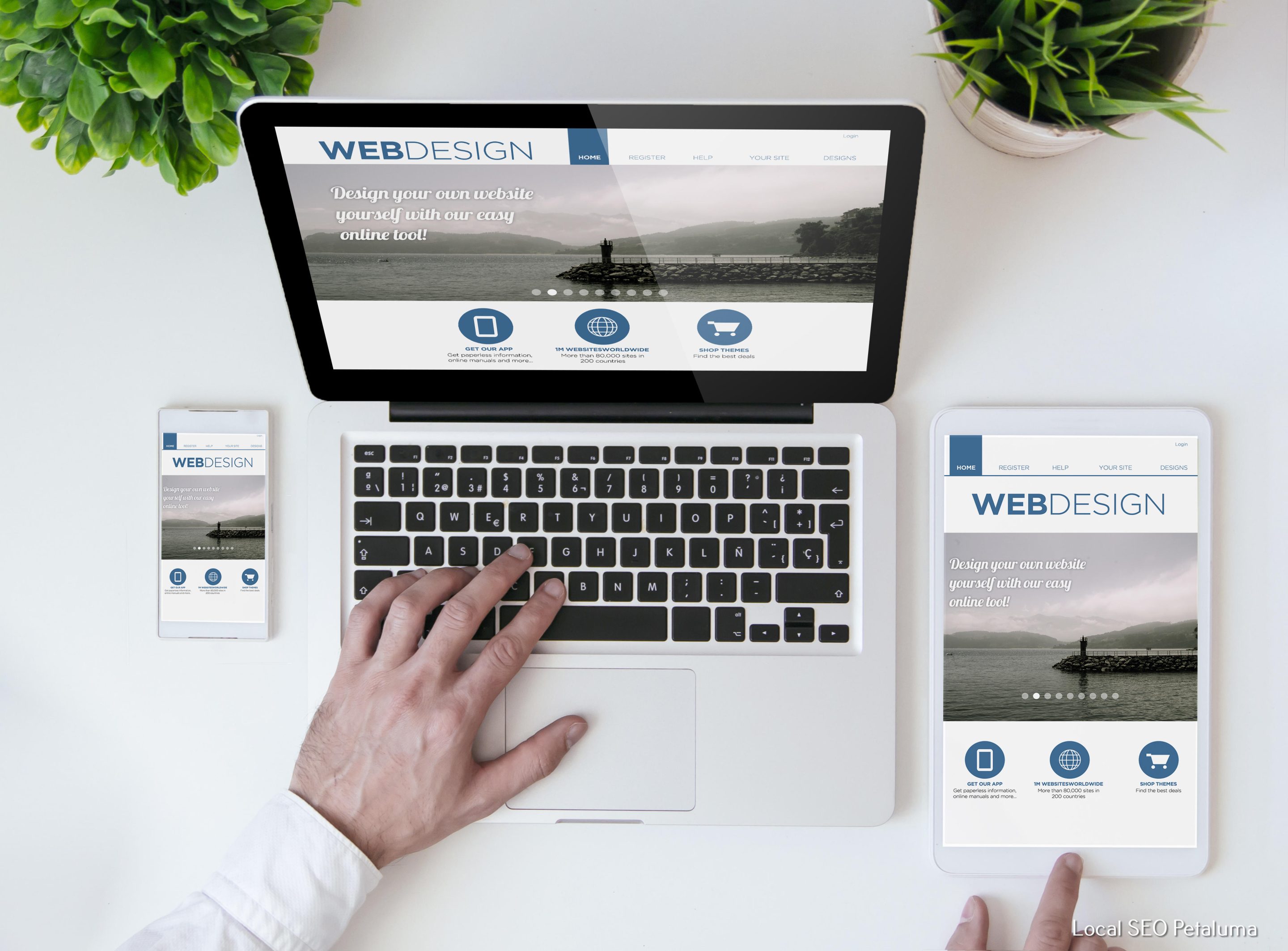
Focus on Design
The design of your landing page plays an important role in how successful it is at converting visitors into customers. A cluttered design with too much information can be overwhelming and confusing, while a clean design with only the necessary elements will encourage visitors to take action.
When designing or redesigning a landing page, be sure to use visuals and other elements that draw visitors’ attention without cluttering up the page. Use colors that are complementary but not distracting, and keep fonts simple and easy to read. If possible, use images or videos that are relevant and engaging; these can help draw people in and encourage them to take action after they’ve finished reading or watching your content.
Optimize Your Call-to-Action (CTA)
Your call-to-action (CTA) is one of the most important elements on any landing page; this is what encourages people to take action after reading or viewing your content. The CTA should be clear and concise; if possible, make it stand out from the rest of the content on the page by using contrasting colors or an eye-catching font size or style. Additionally, make sure that your CTA directs users where they need to go – whether that’s signing up for an email list or purchasing a product – so they don’t get confused about what they should do next.
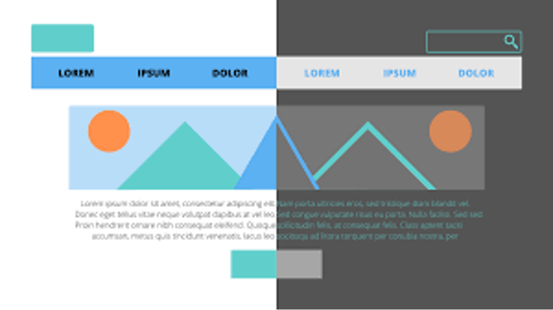
Utilize A/B Testing
A/B testing allows you to compare two versions of a web page against each other in order to determine which version performs better in terms of conversions and other metrics such as time spent on site or bounce rate (the percentage of people who leave after viewing just one page). For example, if you have two versions of a landing page with different designs or CTAs, you could run an A/B test by sending 50% of traffic towards each version in order measure which version performs best over time based on certain criteria such as conversion rate or time spent on site. This type of testing allows you test different variations quickly while also gathering valuable data about user engagement and performance so you can continuously improve upon existing pages over time.
Use Popups Wisely
Popups are often used as effective conversion tools; however, if used incorrectly they can be annoying rather than helpful for users visiting your website —which could result in decreased conversions instead of increased ones! When using popups for lead generation purposes (such as collecting email addresses), try not display them immediately when someone first visits your site; instead wait until someone has been onsite for at least 30 seconds before displaying the popup so they have had enough time become interested in what you have offer before being presented with an option signup form right away! Additionally, avoid using overly aggressive popups such as those that prevent users from leaving until their input has been provided–these types popups tend scare away more potential customers than actually capture them!
Include Social Proof
Social proof is essential when it comes optimizing any web page for maximum conversions–this refers evidence such as customer reviews ratings which helps build trust with potential customers who may not yet familiar with what exactly it is that offer! If possible include customer reviews directly onor nearyour CTA find out how others have found success when working product service–seeing positive feedback from others often motivates potential customers push through any doubts hesitations may have been experiencing prior making purchase decision!
Showcase Benefits & Features
People want know exactly how their lives will improved by taking advantage offer present them–whether this means saving money time simplifying complicated process etc.–so make sure clearly showcase both benefits features associated product service near top bottom web pages well within CTA itself this way those who visit landings pages aware exactly why should choose go ahead proceed purchase!
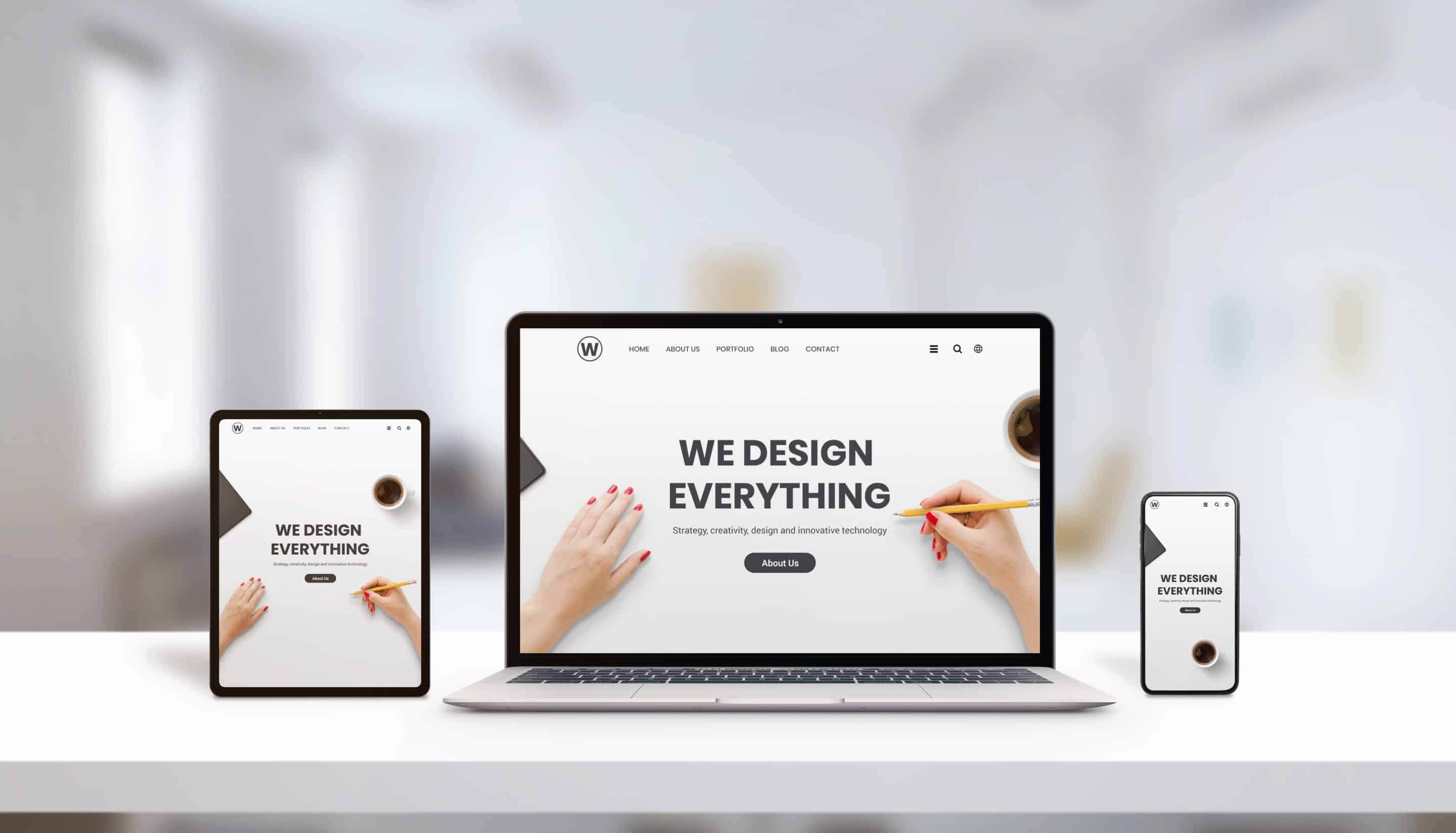
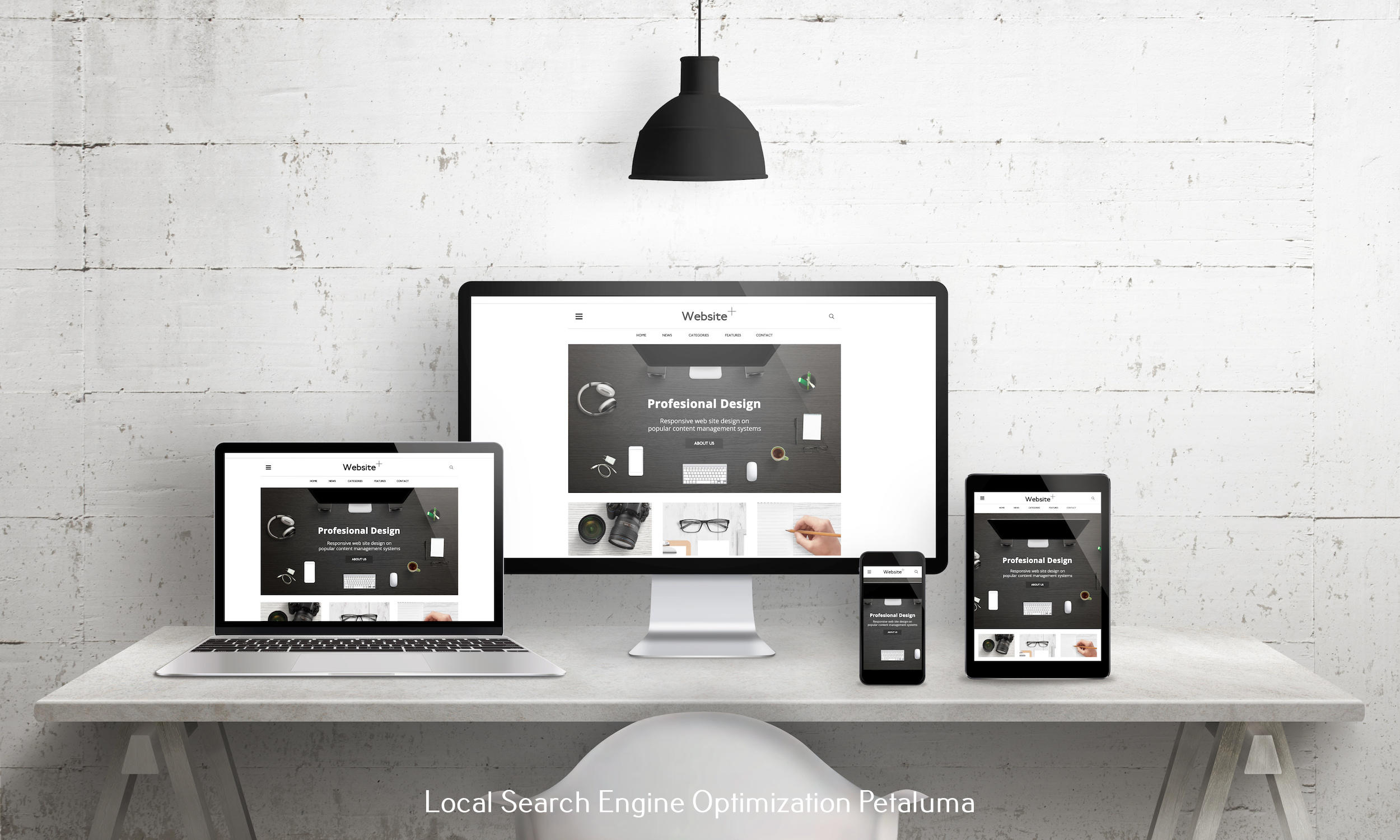
Make Mobile Optimization Priority
With majority internet usage coming from mobile devices optimizing webpages mobile friendly must priority today's digital marketing landscape Mobile optimized websites ensure visitors won't face lags slow loading times which could lead abandoning website altogether thus harming overall conversion rate drastically Therefore always double check both desktop mobile versions all sites ensure user journeys are optimized accordingly no matter whatever device accessing from !
Conclusion
Optimizing your landing pages for maximum conversions doesn't have be daunting task as long utilize some creative techniques discussed above such focusing design optimizing CTA running A B tests including social proof showcasing benefits features making mobile optimization priority By following these tips strategies should see positive impact conversation rates soon enough !

















0 Comments