

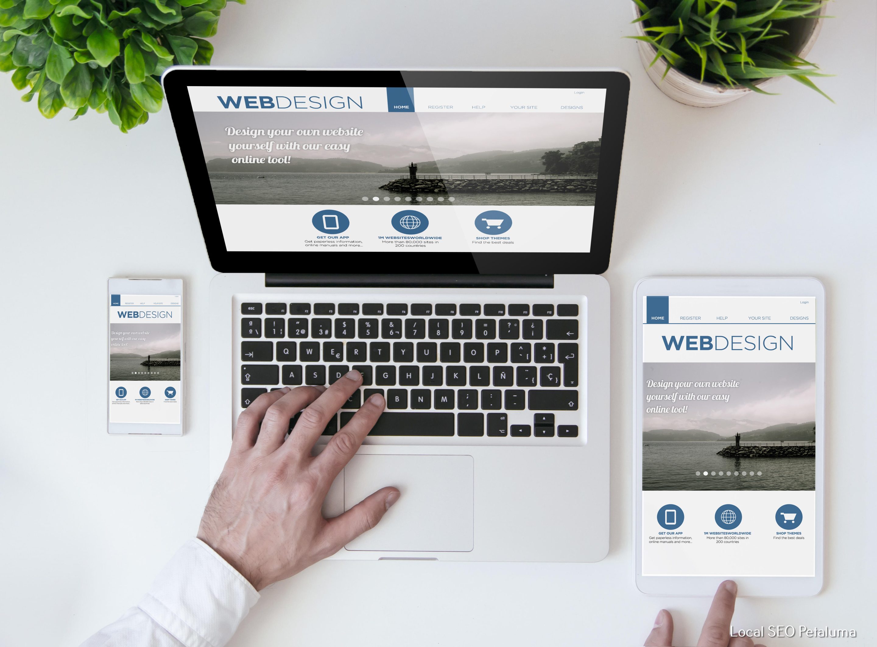
When it comes to designing a successful landing page, one of the most important elements is the call to action button. This small but mighty button serves as the final step in converting visitors into leads or customers. In fact, according to a study by Small Biz Trends, websites with a clear call to action have a 47% higher conversion rate than those without one. So, how can you craft the perfect call to action button for your landing page? Let's explore some best practices and examples.
Understand Your Audience
Before we dive into the specifics of designing your call to action button, it's crucial to understand your target audience. What motivates them? What pain points do they have? What language do they use? By understanding your audience, you can tailor your call to action button and its messaging specifically for them.
Keep It Simple
When it comes to designing an effective call to action button, simplicity is key. You want to make sure that it's easy for visitors to understand what you want them to do and how they can do it. This means using clear and concise language that gets straight to the point.
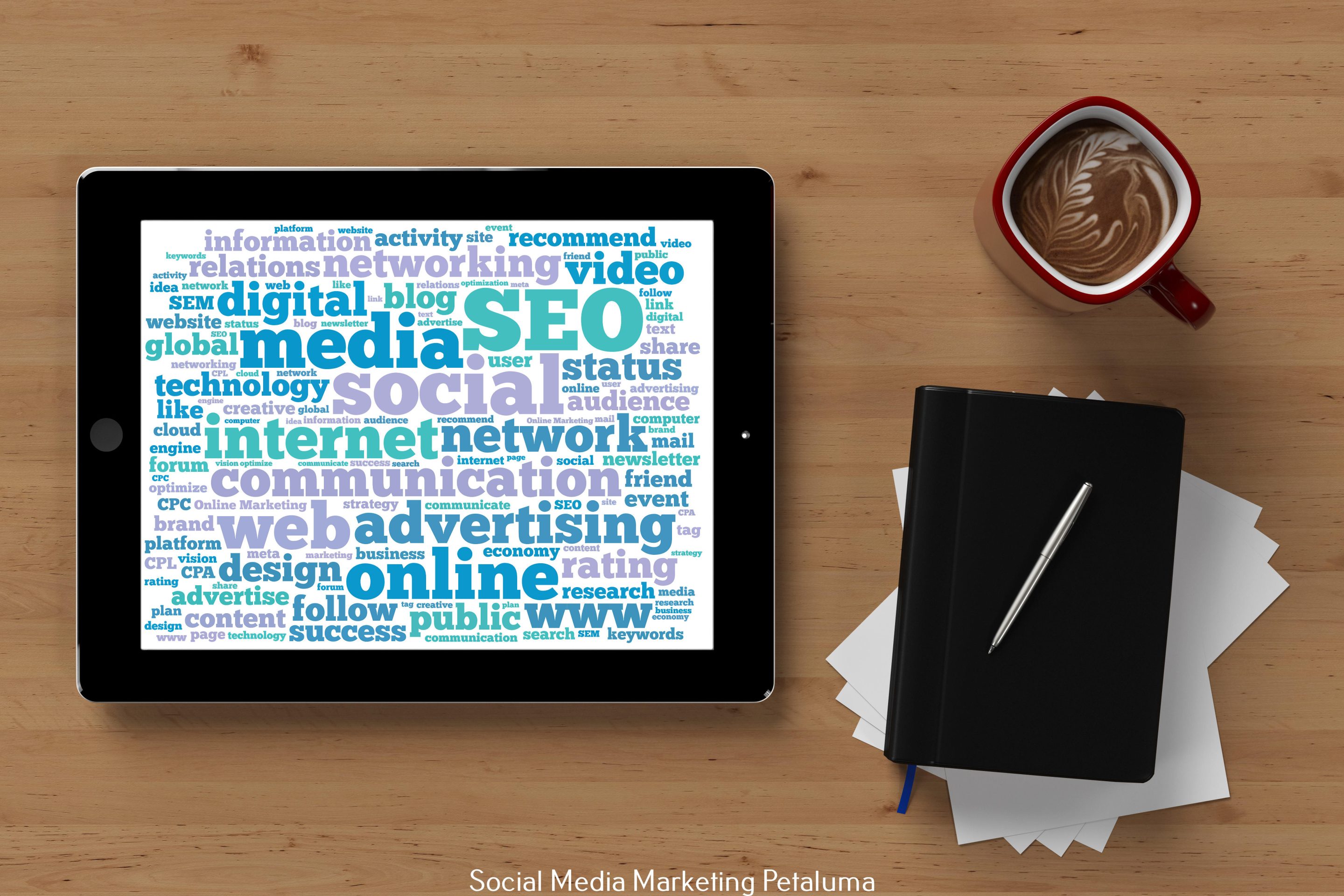
For example, instead of using generic phrases like “click here” or “submit,” try using more specific language that aligns with your brand and speaks directly to your audience's needs. For instance, if you're a digital marketing agency targeting businesses in North Bay and Sonoma County, your call-to-action text could be “Grow Your Business Now” or “Get More Leads Today.”
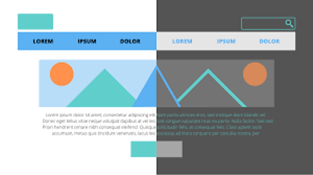
Choose Contrasting Colors
Your call-to-action button should stand out from the rest of your webpage so that visitors can easily spot it. Choosing contrasting colors is an excellent way of achieving this goal. As a general rule of thumb, use colors that are different from those used in other elements on the page.
For example, if you're using warm colors like red or orange for your website design, consider using a cool color like blue or green for your call-to-action button. This color contrast will make your button pop and draw visitors' attention.
Make It Visible and Above the Fold
Since the call to action button is the final step in converting visitors into leads, it should be easily visible on the page. Visitors shouldn't have to scroll down to find it; it should be above the fold. This means that it should be placed high enough on the page, so visitors don't have to scroll down to see it.
Additionally, make sure that there is enough white space around your call-to-action button so that it doesn't get lost in a cluttered design. This will help draw attention to the button and make it more noticeable.
Use Urgency and Action-Oriented Language
To encourage visitors to take immediate action, use urgency and action-oriented language in your call-to-action text. Urgency creates a sense of scarcity or time sensitivity, making visitors feel like they need to act fast before missing out.
For example, if you're running a limited-time offer or hosting an event, use phrases like “limited time offer” or “register now” in your call-to-action text. This will create a sense of urgency and motivate visitors to take action immediately.
Test Different Options
Designing the perfect call-to-action button is not a one-size-fits-all approach. What works for one website may not work for another. That's why it's essential to test different options and see what works best for your specific audience.
For instance, you can test different colors, sizes, placement on the page, and even different wording in your call-to-action text. Use A/B testing tools such as Google Optimize or Crazy Egg to track which variations perform better and adjust accordingly.
Examples of Effective Call-To-Action Buttons
Now that we've covered some best practices let's take a look at some examples of effective call-to-action buttons:
1. Slack
Slack's call-to-action button is simple, eye-catching, and above the fold on their homepage. The bright green color of the button contrasts well with the rest of the page, making it stand out. The text also uses action-oriented language, saying “Get Started” instead of a generic “Sign Up.”
2. Airbnb
Airbnb's call-to-action button is a great example of using urgency in their messaging. They use phrases like “Book Now” and “Instant Book” to create a sense of urgency and encourage visitors to take immediate action.
3. Grammarly
Grammarly's call-to-action button is an excellent example of understanding your audience and tailoring your messaging to speak directly to them. Instead of using generic phrases like “Sign Up,” they use the more specific text, “Add Grammarly for Free.” This appeals to writers or anyone looking to improve their writing skills.
In conclusion, crafting the perfect call to action button for your landing page requires understanding your audience, keeping it simple and visible, using contrasting colors, incorporating urgency and action-oriented language, and testing different options. By following these best practices and taking inspiration from effective examples like Slack, Airbnb, and Grammarly, you can design a compelling call-to-action button that drives conversions for your business.


0 Comments