Have you ever thought about the power of your Call To Action (CTA)? It’s the one thing that gets your potential customers to act. It’s the one thing that gets them to buy, subscribe or download.
Yet, so often, CTAs are ignored and neglected. They blend in with the rest of the content on a page and don’t stand out enough to capture attention—and they certainly don’t compel people into action.
But crafting simple and compelling copy for CTAs doesn't have to be hard or complicated. In fact, there are some easy-to-follow steps you can take right away that will help you make sure your CTA stands out and convinces people to take action.
Making Your CTA Stand Out
The first step is making sure your CTA stands out from the rest of your content on a page. This means keeping it simple—just two or three words—and making it bold so it immediately draws attention when someone lands on a page. Here are some examples:
• Buy Now • Sign Up Today • Download Free Guide • Try Now • Get Started Now
These phrases are short and punchy but also informative; they tell people exactly what they need to do next without going into too much detail or being overly wordy. You also want to make sure that your CTA is placed above the fold, meaning it appears at the top of your web page before someone has even had a chance to scroll down (or at least in an easily visible spot if scrolling is necessary). Doing this ensures maximum visibility so people won't miss it when they arrive on a page.
Utilizing Color Contrasts & White Space Effectively
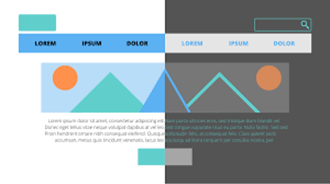
Once you have placed your CTA in an easily visible location above the fold, now comes time for design elements like color contrasts and white space that will help draw attention even more effectively. For example, try using contrasting colors between text and background colors or adding more white space around a button which will help it stand out even more against other elements on a page such as text blocks or graphics images . Doing this helps create visual cues that draw attention toward whatever element you're trying to emphasize most—in this case, being your CTA button(s).
Writing Compelling Copy That Convinces People To Act
Now comes time for writing effective copy for CTAs themselves that actually convinces people into taking action after they've landed on a page with their eyes drawn toward where you want them to go next! The most important thing here is being concise but still communicating all necessary information: what exactly do people need to do next? What's in it for them if they do? What's going happen once they click? All these questions should be answered in just two or three words; nothing more than that! Here are some examples:
• Get Your Free Report Now • Claim Your Discount Now • Download Instantly • Access Now & Save 10%
These short phrases both provide necessary information while conveying urgency; something that many effective CTAs have in common. You also want avoid using jargon as much as possible—stick with language everyone can understand! Finally, try incorporating words like “You” which focus directly on potential customers instead of talking about yourself all the time; this helps build empathy with someone reading copy by making them feel like their individual needs are being taken care of rather than just generic statements about yourself/your business/your product/etc…
Incorporating Images & Other Visual Elements Into Your Copy
Finally, another great way get people interested in acting upon seeing a CTA is by incorporating visuals into its design such as icons or images related directly back onto what's being offered (such as a free ebook cover image if someone needs download something). Even small changes like including arrows pointing directly towards buttons can make huge differences when it comes encouraging clicks from potential customers! Taking these extra steps not only look better visually but also help provide context around what's being offered without needing too much explanation from written copy itself; sometimes visuals speak louder than words!
Conclusion It might seem like crafting compelling CTAs takes effort but once you know how best utilize design elements along with writing persuasive copy then creating ones becomes easier than ever before! Remember: keep everything concise yet informative at same time; utilize contrast colors between text & backgrounds along with including helpful visuals when possible; incorporate “you” language instead of talking about yourself all time…and always remember place CTAs above fold so everyone sees them no matter where they land on pages!


0 Comments