The Psychology of Color: How to Use It in Your Website Branding and Marketing
When it comes to website branding and marketing, one crucial aspect that is often overlooked is the use of color. Many business owners focus on creating a visually appealing website, but they fail to understand the impact that colors can have on their audience. Colors can evoke certain emotions, influence buying decisions, and ultimately shape a brand's identity. In this article, we will break down the psychology of color and how you can use it effectively in your website branding and marketing.
Understanding Color Psychology
Color psychology is the study of how colors affect human behavior and emotions. It suggests that different colors have different meanings and can elicit specific emotions from individuals. For instance, blue is often associated with trust, while red can evoke feelings of excitement or danger.
When it comes to website branding and marketing, understanding color psychology is crucial as it allows businesses to communicate their message effectively through visual cues. By using the right colors in your branding materials, you can influence how your audience perceives your brand.
Choosing the Right Colors for Your Website
Now that we have established the importance of color psychology let's dive into some practical tips for choosing the right colors for your website.
1. Understand Your Brand Identity
Before you start picking out colors for your website, it's essential to understand your brand identity thoroughly. What does your brand stand for? Who is your target audience? What emotions do you want to evoke in them?
For example, if you're a luxury brand targeting high-end clients, using bold and vibrant colors may not be suitable as they may come across as too loud or flashy. Instead, opt for more muted tones such as black or gold that convey sophistication and elegance.
2. Consider Your Industry
Different industries have different color associations based on their products or services. For instance, green is often associated with health or eco-friendly products while red may be more suited for the food industry. Understanding the color associations in your industry can help you choose colors that align with your brand and target audience.
3. Keep It Simple
When it comes to website design, less is often more. Choosing too many colors can be overwhelming and distracting for visitors, making it challenging to communicate your message effectively. Stick to a maximum of three or four colors for your website's branding, including your logo.
4. Use Contrast Wisely
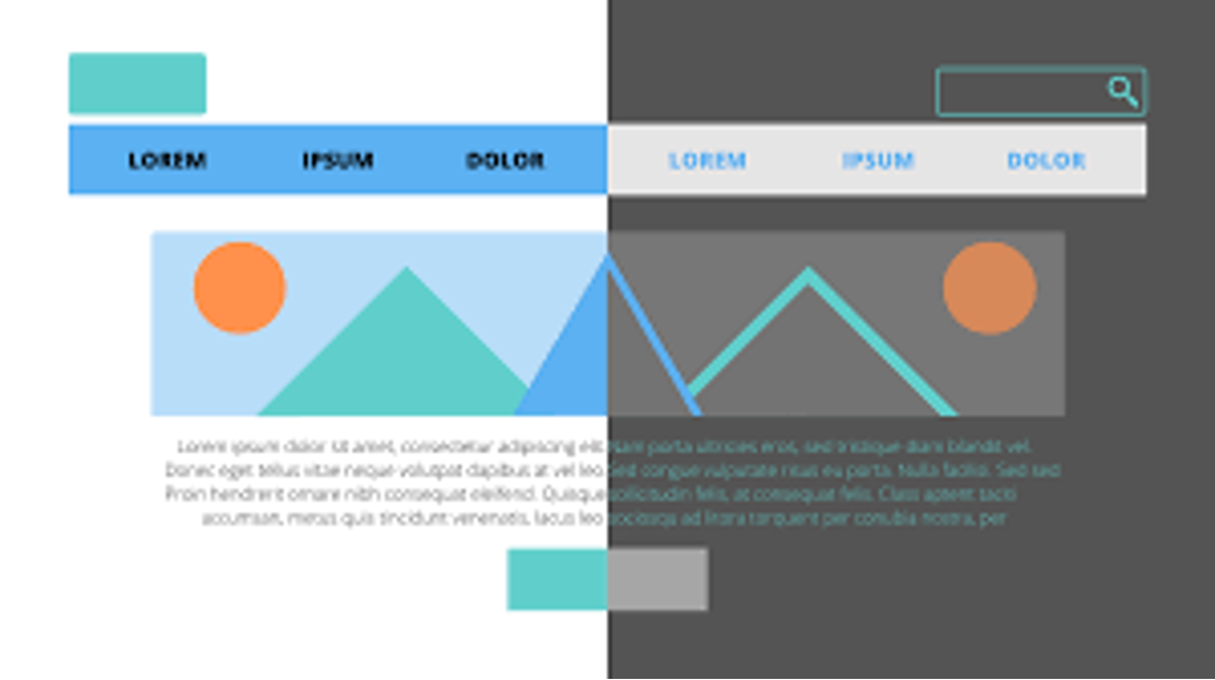
Contrast is essential in web design as it helps create a visual hierarchy and guides the user's eye towards key elements on the page. However, using too much contrast or clashing colors can be jarring and unappealing. For text, always use a dark color on a light background for easy readability.
5. Use Color to Create Emotion
As mentioned earlier, different colors can evoke different emotions in individuals. Use this knowledge strategically in your website branding to create the desired emotional response from your audience.
For example, yellow is often associated with happiness and optimism, making it suitable for brands that want to convey a positive message or evoke feelings of joy in their customers. On the other hand, blue is known for its calming effect and is commonly used by brands that want to promote trust or reliability.
Incorporating Color into Your Marketing Strategy
Now that you have chosen the right colors for your website let's discuss how you can use them effectively in your marketing strategy.
1. Consistency Is Key
Consistency is crucial when it comes to branding and marketing efforts. Make sure that all your marketing materials such as social media posts, email newsletters, and print ads use similar color schemes as your website. This creates a cohesive look and reinforces brand recognition with your audience.
2. Use Colors Strategically
Colors can also be used strategically in marketing materials such as calls-to-action (CTAs). For instance, red CTAs have been found to have a higher click-through rate than any other color. This is because red is associated with urgency and can create a sense of FOMO (fear of missing out) in users.
3. Test and Analyze
As with any marketing strategy, it's crucial to test and analyze the effectiveness of your color choices. Use A/B testing on different elements of your website, such as button colors or background images, to see which ones resonate best with your audience.
In conclusion, the psychology of color plays a significant role in website branding and marketing. By understanding how colors can influence emotions and perceptions, businesses can use them strategically to create a strong brand identity and connect with their target audience. Remember to keep it simple, be consistent, and use colors strategically for maximum impact in your website branding and marketing efforts.












0 Comments