In today's digital age, having a strong online presence is crucial for any business looking to succeed. And with the majority of internet users accessing websites through their mobile devices, it's more important than ever to prioritize mobile first design. In this article, we'll discuss why mobile first design matters and how to implement it effectively.
Why Mobile First Design Matters
Mobile first design refers to the approach of designing a website for mobile devices first before scaling up for larger screens such as desktops or tablets. This may seem counterintuitive since desktops have traditionally been the primary way people access the internet. However, with the rise of smartphones and other handheld devices, designing for them has become a necessity.
1. User Behavior
The shift towards mobile devices as the preferred method of browsing has been driven by changes in user behavior. People are increasingly using their phones on-the-go and expect fast and easy access to information. This means that websites need to be optimized for smaller screens and touch interactions.
Moreover, studies have shown that users are more likely to abandon a website if it takes longer than three seconds to load on their phone. This highlights the importance of creating a seamless user experience on mobile devices.
2. Search Engine Optimization (SEO)
In addition to user behavior, search engines also prioritize mobile-friendly websites in their rankings. With Google's algorithm updates focusing on rewarding sites that provide a good experience on all devices, having a responsive or mobile-first design is crucial for SEO success.
Implementing Mobile First Design
Now that we understand why mobile first design is essential let's discuss how businesses can implement it.
1. Simplify Navigation
On smaller screens, navigation menus can take up valuable space and make it difficult for users to find what they're looking for quickly. When designing for mobile, consider using icons instead of text links in your navigation menu and keep it simple by limiting the number of options available.
2. Use Responsive Design
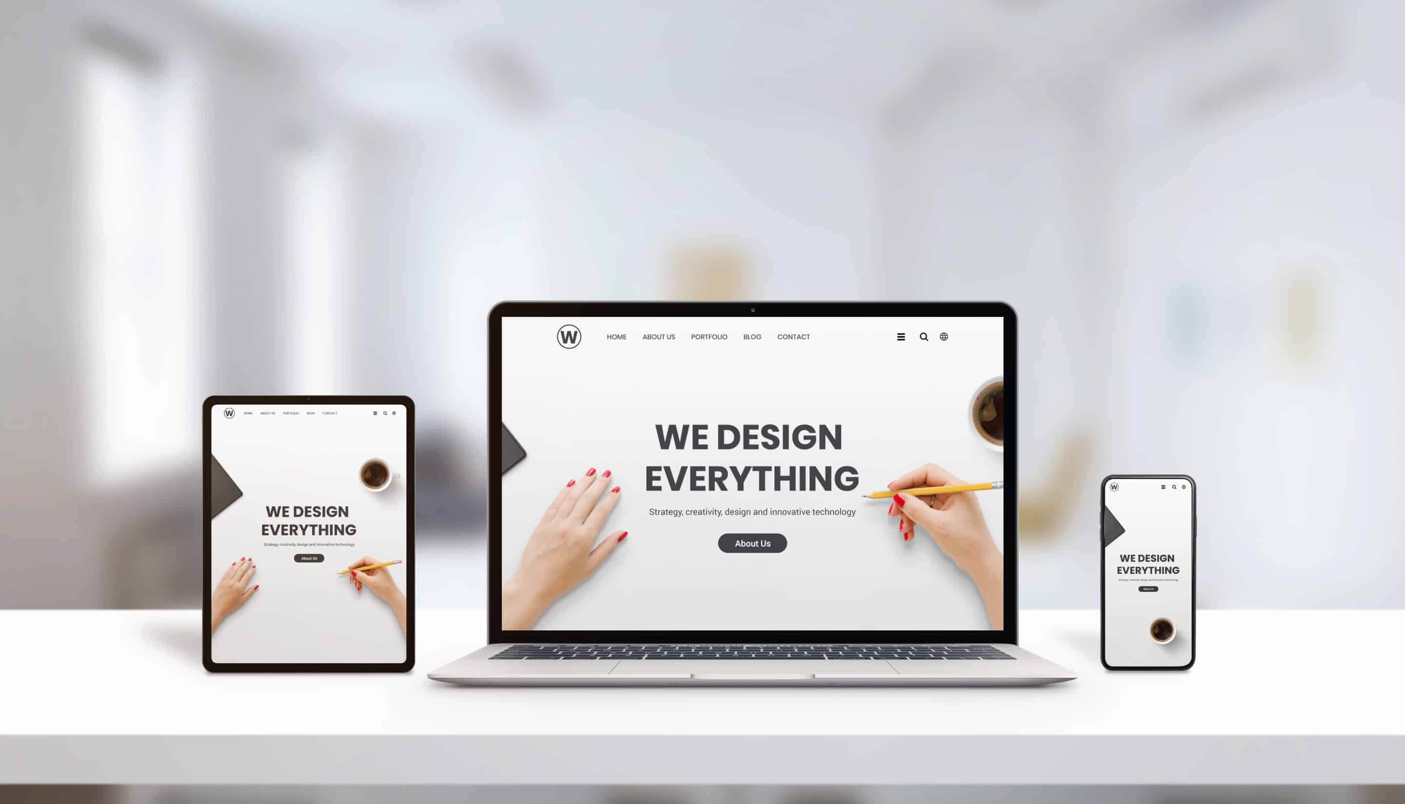
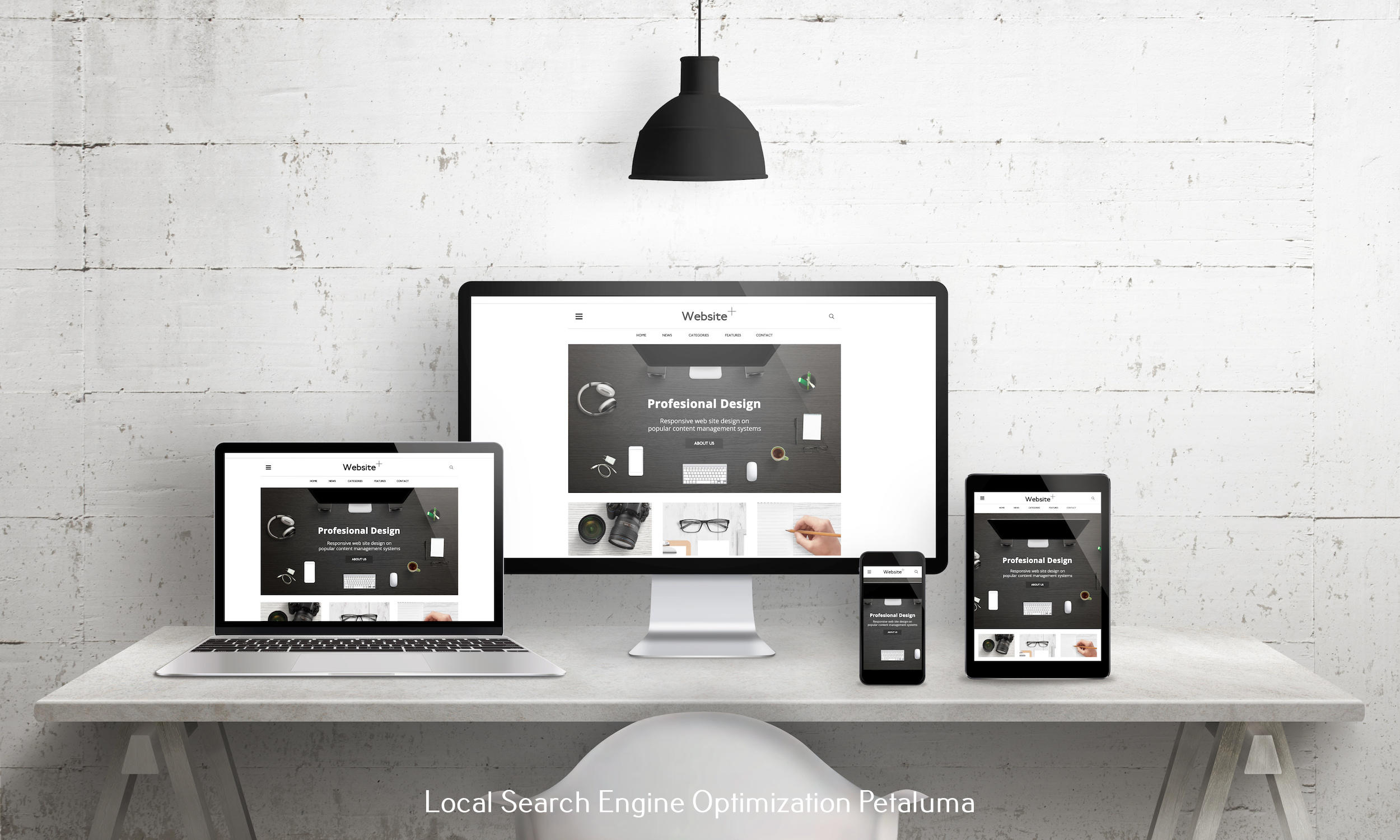
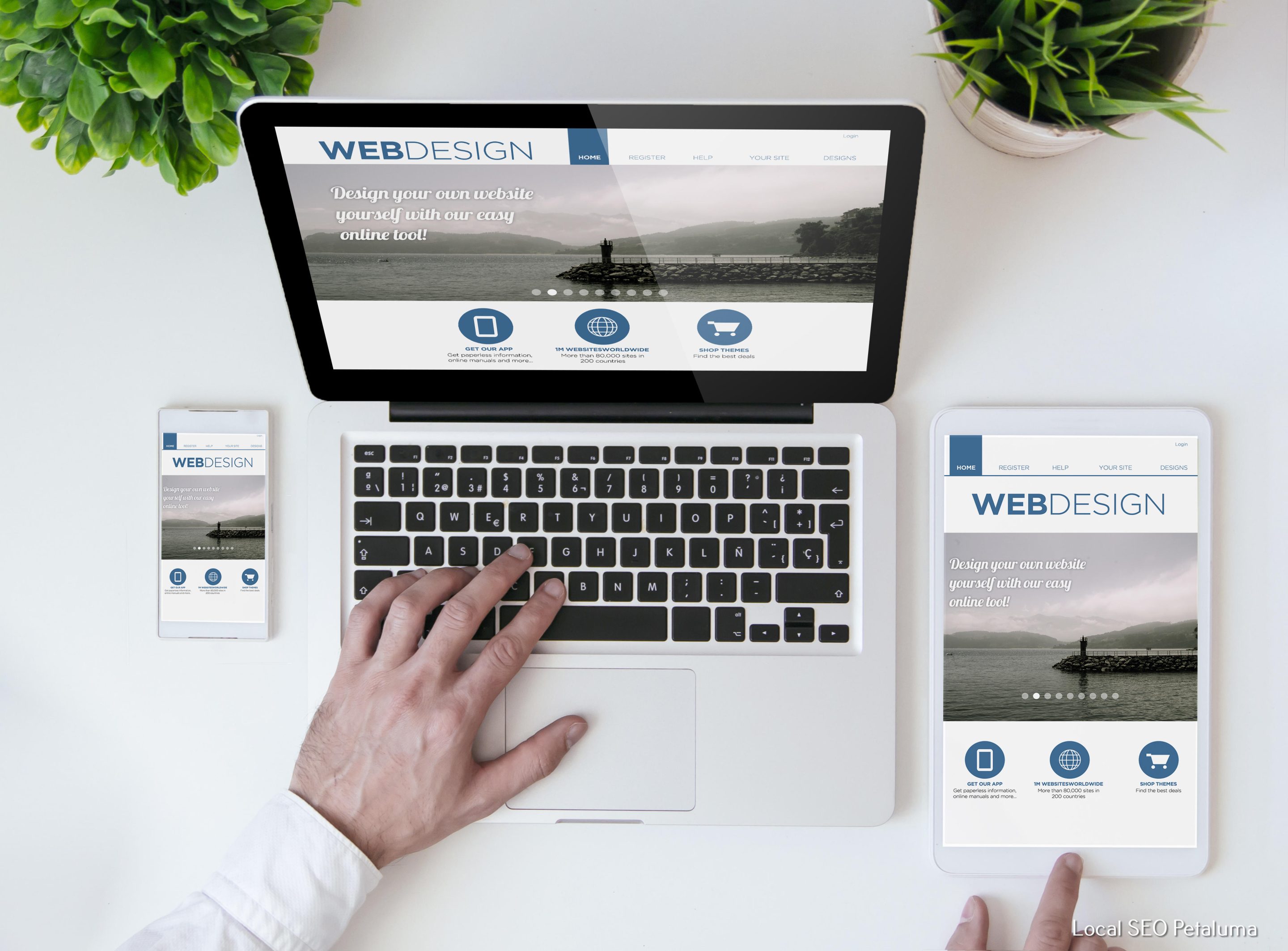
Responsive design is an approach that allows a website to adapt to different screen sizes and devices. This means that the same website will display differently depending on the device it's being viewed on. Responsive design is a great option for businesses looking to create a consistent user experience across all devices.
3. Optimize Images and Videos
Large media files can significantly slow down load times, especially on mobile devices. To ensure fast loading times, optimize images and videos for mobile by compressing them without losing quality.
4. Utilize White Space
Whitespace or negative space refers to the empty space between elements on a webpage. It not only improves readability but also makes the site feel less cluttered, especially on smaller screens. When designing for mobile, leave enough white space around important elements to make them stand out and improve usability.
Color Psychology in UX Design: Choosing the Right Palette for Emotional Impact
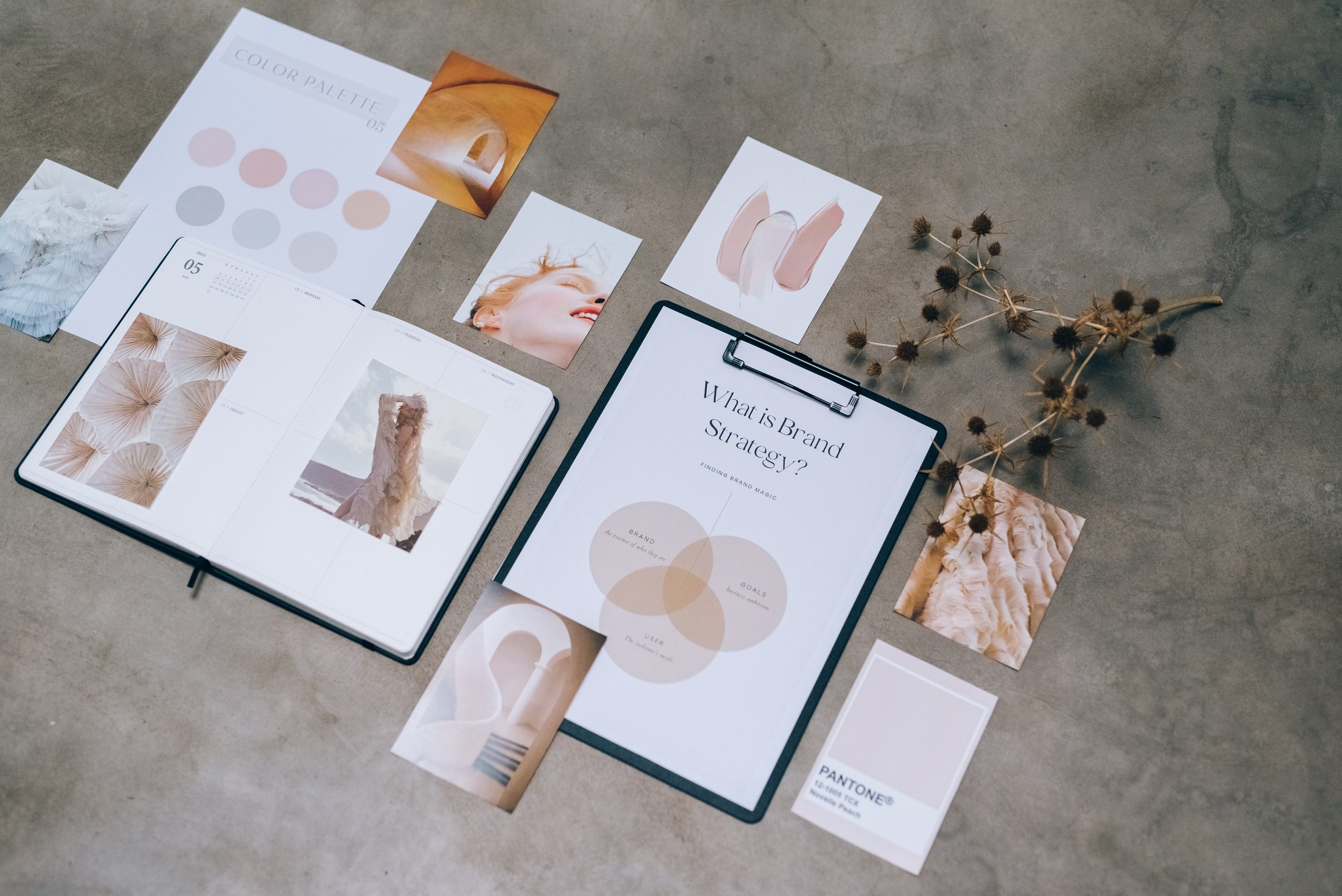
While designing for mobile first is crucial, it's equally important to consider the emotional impact of your website's color palette. Your choice of colors can greatly influence how users perceive your brand and interact with your site.
1. Understand Color Meanings
Colors evoke specific emotions and associations in people, which can vary depending on cultural backgrounds and personal experiences. For example, red symbolizes passion and excitement in Western cultures but represents mourning in many Asian cultures.
It's essential to research the meanings behind different colors before choosing a palette that aligns with your brand messaging.
2. Consider Contrast
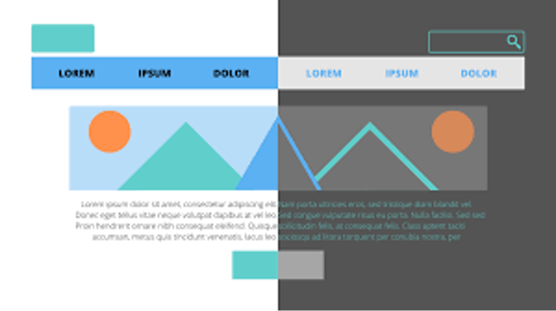
Contrast refers to the difference between light and dark shades used in design elements such as text, images, and backgrounds. A good level of contrast not only makes content easier to read but also helps create visual interest.
When designing for mobile devices where screen size is limited, using high contrast colors can make important information stand out and improve user experience.
3 .Choose an Appropriate Color Scheme
There are various color schemes you can choose from when designing your website. Some popular options include monochromatic, complementary, and analogous color schemes.
Monochromatic schemes use different shades of the same color, while complementary schemes pair opposite colors on the color wheel. Analogous schemes use colors that are adjacent to each other on the color wheel.
Consider your brand's personality and choose a color scheme that reflects it best. For example, a finance company may opt for a monochromatic blue scheme to convey trust and reliability, while a health and wellness brand may use an analogous green palette to evoke feelings of nature and well-being.
In conclusion, mobile first design is crucial for businesses looking to create a seamless user experience and improve their online presence. By simplifying navigation, using responsive design, optimizing media files, and utilizing white space, you can ensure your website is optimized for mobile devices.
In addition to mobile first design, carefully choosing your website's color palette can greatly impact how users perceive your brand. By understanding color meanings, considering contrast, and choosing an appropriate color scheme, you can create an emotional impact that resonates with your target audience.
So if you want to stay ahead in the digital landscape and make a lasting impression on potential customers in North Bay or Sonoma County – prioritize mobile first design and utilize the power of colors in UX design.












0 Comments